
You take your dog on a walk like you do every evening after work. But where do you go? The same old dog park? You reach out to friends and neighbors and ask them to join you but no one seems to have the same schedule as you. So the dog park it is, but, wait those chaotic dog parks are always so unpredictable due to the abundance of dogs! Isn’t there an easier way to find my dog the social stimulation he needs?
This is where I see a problem that needs a solution. I love my dog and being able to socialize with other dog-owners. But dog parks are one of the things I am always left feeling overwhelmed after experiencing. The problem of feeling overwhelmed when going to the dog park to play should go as planned and be fun! The solution I aim to solve is as follows: to help others access information about the dog’s in the area and where pet-friendly areas are that we can go.
The ultimate impact I'm trying to achieve is to give an alternative method to dog owners that will allow their dogs to experience safe and healthy interactions with other canines.

It's all about asking the right questions...
Gen Xers and Millennials makeup more than 2 out 3 pet owners in the United States.
48% of Gen Xers and Millennials believe dog’s only socialize at dog parks
More than 78% of dog owners believe their dogs should have at least two walks a day.
64% of dog owners believe that walking their dog reflects their love and affection for their pets.
4 out of 5 dog-owners claim to socialize with other dog-owners while on their daily walks.
Dog ownership has risen steadily by 21.9% in the last 20 years, while dog parks have increased by 40% in the last 10 years.
Due to the time constraint of this project, I came up with a list of assumptions to narrow down the variables and increase the accuracy of this problem space.
The initial users will be targeted to attentive and active dog-owners that have a busy schedule but still have time to walk their dog.
The #1 value users will have is the unique way to find appropriate social stimulation for your dog, and connect with other like-minded dog-owners.
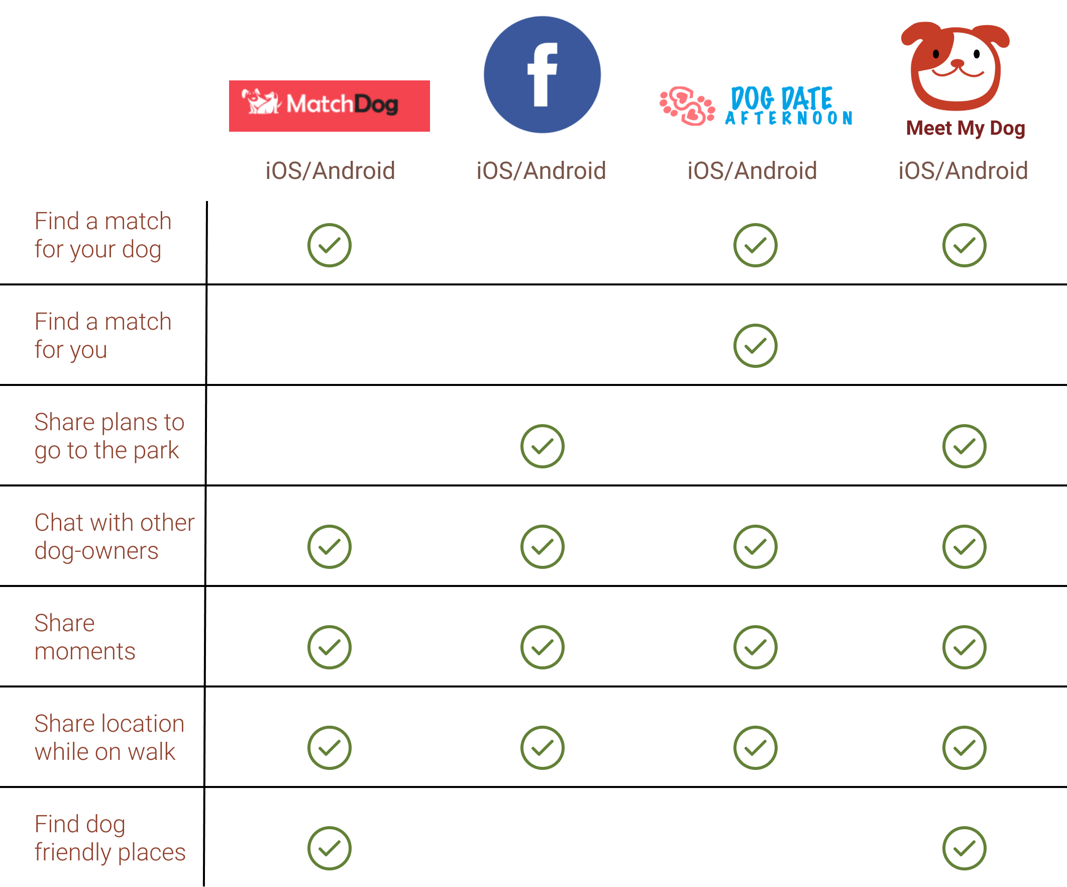
The primary competition in the marketplace would be MatchDog, DogDate, & Meet My Dog.
The users can also benefit by planning social interactions with other dogs, including Birthdays, social gatherings, or simply a game of fetch.
I believe my users have a need to find an alternative method to allowing their dogs to play with others in open spaces without the unpredictable variables.
The biggest risk is users not participating in events created by their matches. This design is dependent on other users connecting with each other.
The product will stand out from the competition by offering a service only active dog-owners will use due to the account expressing both the owner and their dog.
The product will make money based off ads & promotional features of local dog products.
To get a better understanding of what is currently in the market, I looked further into social media apps for dog-owners. MatchDog, Facebook, DogDate, & MeetMyDog seemed to be the top used apps for finding your dog a friend. I conducted a market analysis on the right to further highlight the focus of what my product will cessiate.
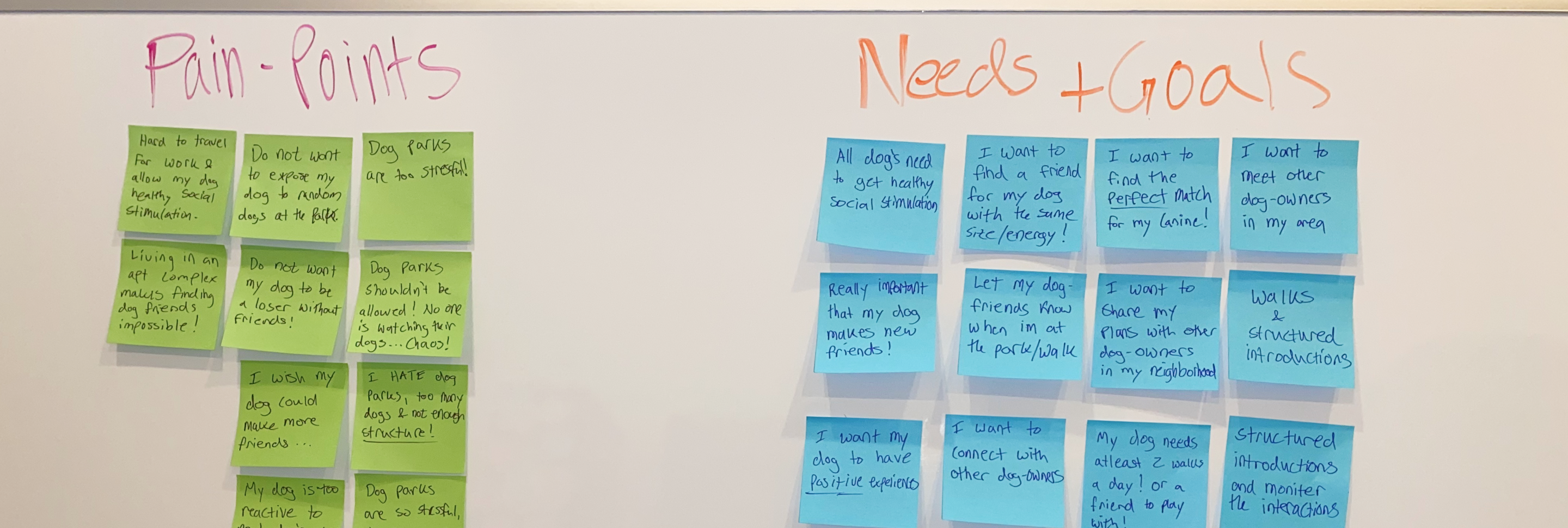
After defining the intended user, I then defined my participant criteria and collected potential participants for in-depth one-on-one interviews with 6 different participants.
I synthesized the results and organized them into 4 main themes to get a visualization and better align my focus on the problem space at hand.
Walks & Introductions
Location & Traveling
Finding the Perfect Dog Match
Connect with Dog Owners
The most common theme was feeling overwhelmed by empathetic feelings towards their dog’s need for social stimulation. I chose to focus on the theme of “Finding the Perfect Match” as this had the biggest influence and it supported my research results.
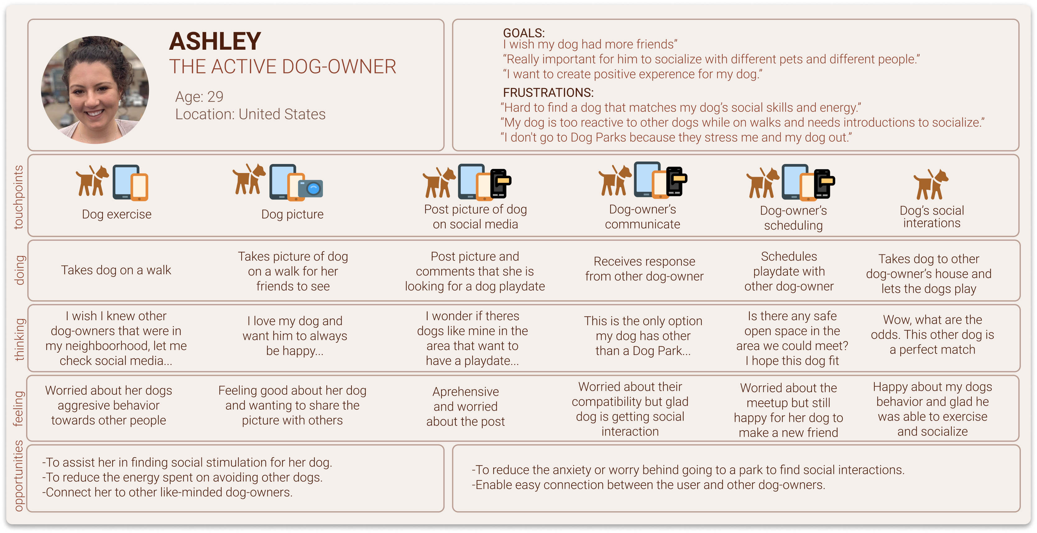
With the data, I combined some of the most common pain points, motivations, and behaviors to form a primary persona and describe a typical dog walking journey for this project.

Using my interview results, I built out an experience map to gather better visualization for my persona Ashley. She felt overwhelmed at the beginning and excited about her experience at the end of her journey walking her dog. I took on the challenge to kill two birds with one stone and started looking at possible solutions to finding people to join you on a walk with your dog that will make the process more streamlined.
I believe that social experiences for dogs occur mainly at dog parks and are both unpredictable, congested, and sometimes chaotic for both the owner and the dog.
How might we help the active dog owner who walk their dogs in suburban areas and seek new social interactions for their dog, find a better alternative to do so?
Looking at the experience map, there seemed to be two points of opportunities to alleviate the problems experienced. I put myself into Ashley’s shoe, and utilized my empathy to create User Stories to highlight the functionality that my design brings. I choose to move forward with the following:
I want to find a match for my dog based on other dog’s breed, size, & personality type so that I can set up a structured social introduction for my dog to find a friend.
The flow I created for Ashley focuses on creating an account and customizing her new dog profile, then matching with nearby dog’s in her area, & finally setting up a structured social interaction that her dog will be very happy about.

Is it user friendly? Does it speak to what the intended solution will be?
Now that I was sure of the task flow I wanted to move forward with. I started to take inspiration from popular apps to see what I wanted to include or not include in my design layout.
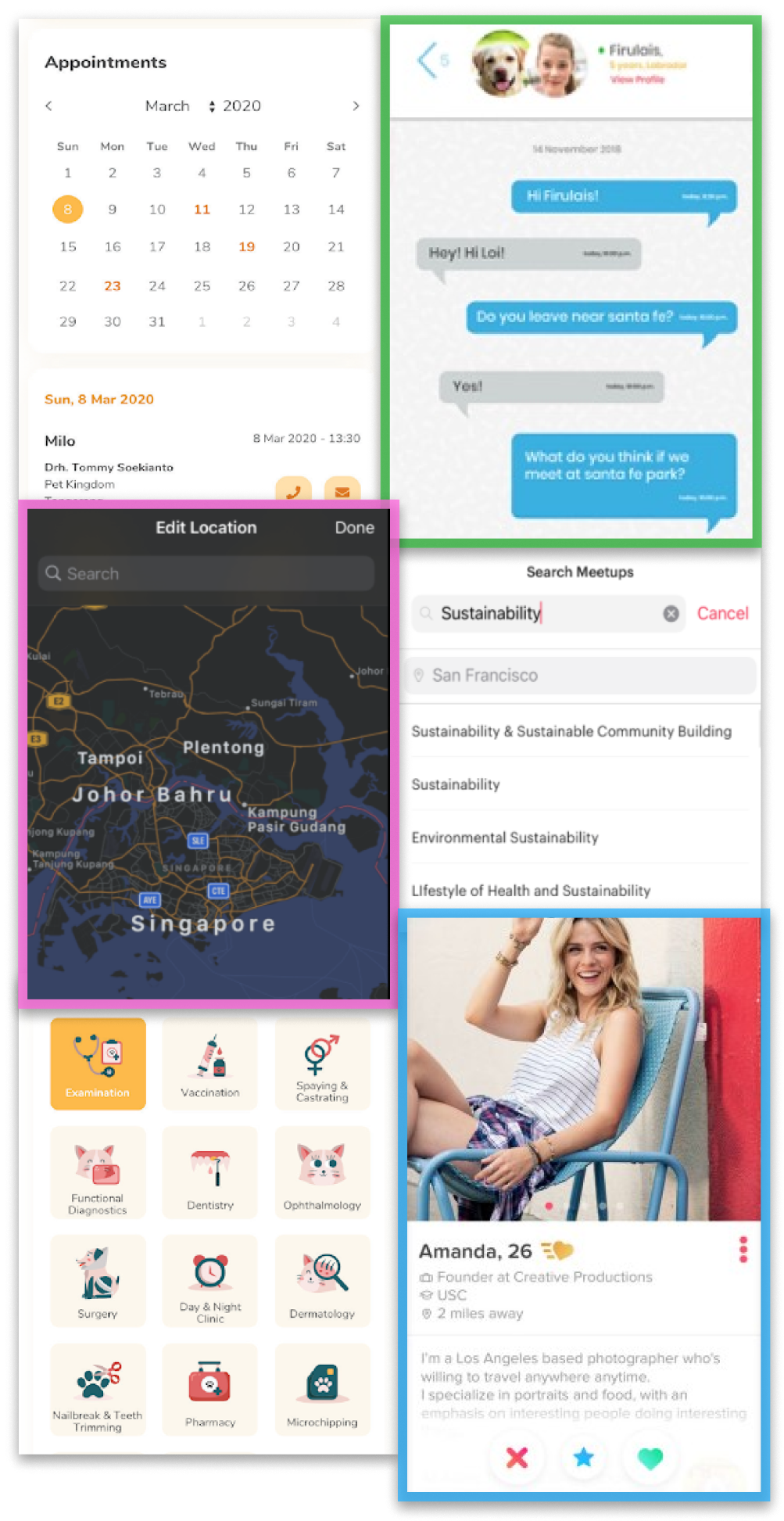
Most common chat features in dog apps emphasize a picture of the owner and dog. Makes it more about the dog relationship and less about the person.
Using this for the map view, showing a detailed colored map of the area and highlighting trails or parks nearby.
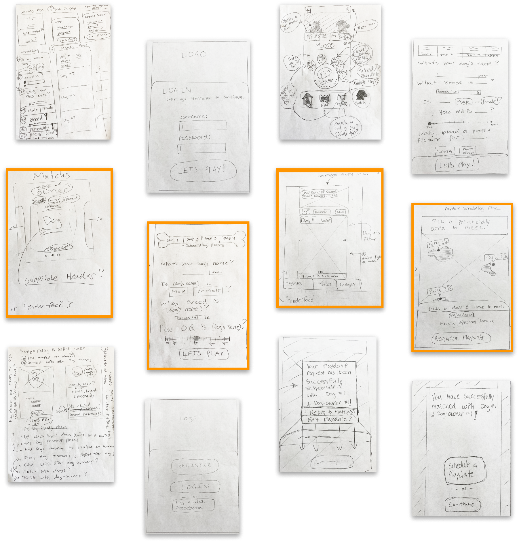
Matching card exploration. This gave me the idea of using the “tinder-face” to make my interface more intuitive to the average user.
I continue to draw more ideas by exploring screen by screen on what the look and feel could entail. Below are some exploration ideas before jumping into creating low-fidelity mock-ups on Sketch. The highlighted sketches are the screens I built upon & from this phase, I decided to move forward with the task flow.
With the screens pulled, I recreated each individual section and translated them into a paper prototype using the Pop App by Marvel to get a general idea of whether or not it made sense.
Simply showing it to a few close friends & family, I was confident and went into creating low-fi wireframes using Figma.
Full prototype can be found here.
The hardest part in all this was learning how to tell a story & guide a user through a task flow with only grey scale wireframes. I learned the importance of narrowing the main task flow before translating the design into a digital format. Grey scale wireframes eliminate the extra noise and judgement a particular color can have on the user, & makes it easier to get right to the point. The sketches were then translated into digital wireframes and prototyped using Figma.


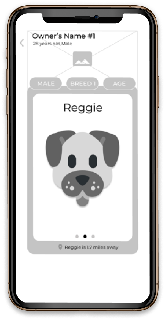
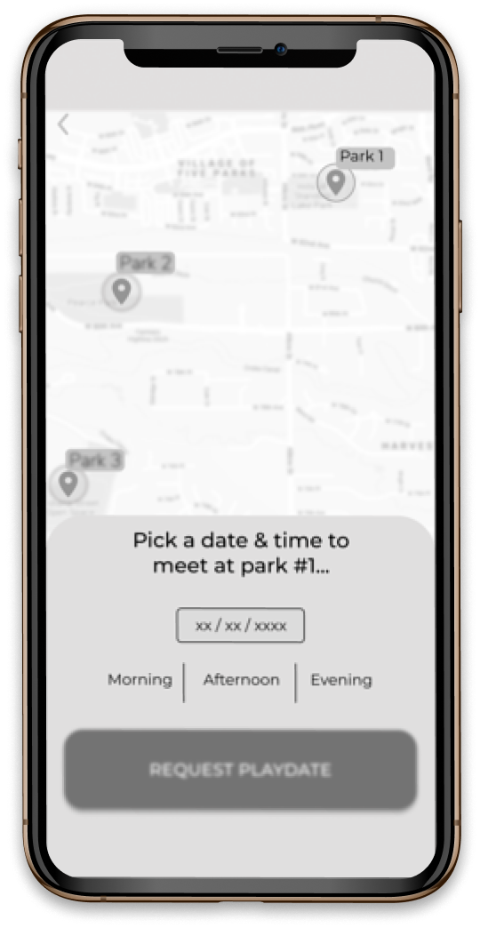

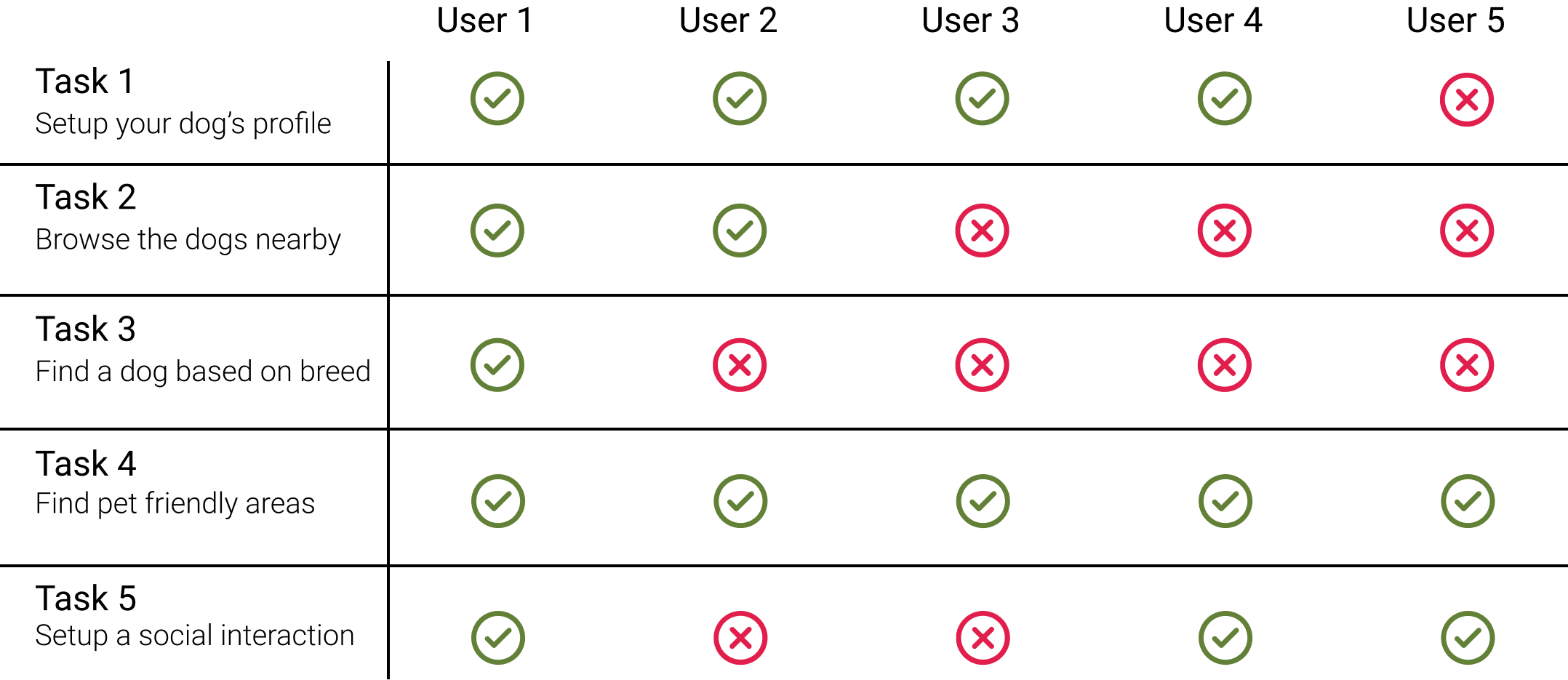
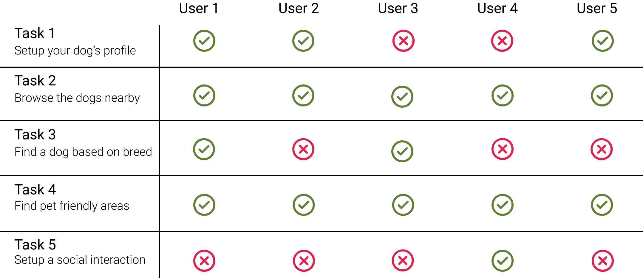
The objective of my user testing was to get a visual understanding of my user’s interactions and overall feedback of the prototype. My initial plan was to define a single task to test. However, the task: “Match with another dog based on their breed, gender, or sex & schedule a playdate at a pet friendly area to facilitate structured interactions” seemed to be too broad. But what would be the most efficient way to phrase the task? I decided to split the main task into 5 co-tasks which all have a particular objective to them. Let’s see how the first 5 testers do.
The most significant finding from Round 1 was the abundance of failed tasks. I laid out the feedback, from both passed & failed tasks, prioritizing those with less effort, higher impact (on this graph to the right) to get a better visual understanding of my overall design and how to make it more intuitive. Not every feedback has a check mark - this was due to the time constraints of my project and impact on my task flow.

Full prototype can be found here.
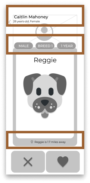
Users were unsure on what to do on this screen.

Where is the map? Is my match close?
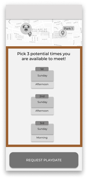
It's hard to schedule with two people’s busy schedules.

Added picture of dog-owner to reduce confusion.
Added CTAs for passing & liking matchs.

Added users location on the map, as well as the location of the match.

Modified the options for scheduling a playdate to include 3 time slots that the user can select.
Based on first round of user testings, changes have been implimented. Round 2 will aim to see if the changes made are more user friendly for users to complete a task.
The results from Round 2 found that users were still having trouble setting up social interactions. I took this feedback and placed it into the prioritization chart below and started ideating how to mitigate some of the problems that arose.
I realized that my original concept for scheduling playdates was too specific and wouldn’t be used by my target audience. I redesigned the concept to be more open ended. Allowing the user to set PlayMarkers, which will notify other dog-owners in the area when they will be going to the park, and allowing them to join if they are free. They do not need to confirm or decline a formal request, they can just show up and have fun!

Full prototype can be found here.

No way to go back from this page or navigate to the playdates.

The testers had little to no idea what the next step was on this screen.

Due to the feedback, the scheduling page was very contraversial to most testers. They were confused by semantics.

Added a menu bar to let user’s navigate from matches to playmarkers without having to go through the process again.

Added a search bar feature to let user’s decide exactly where they want to go instead of making them pick from a list of parks.

By marking a point on the map for other’s to join, it will hopefully mitigate the confusion because it can be seen by all matchs or one.
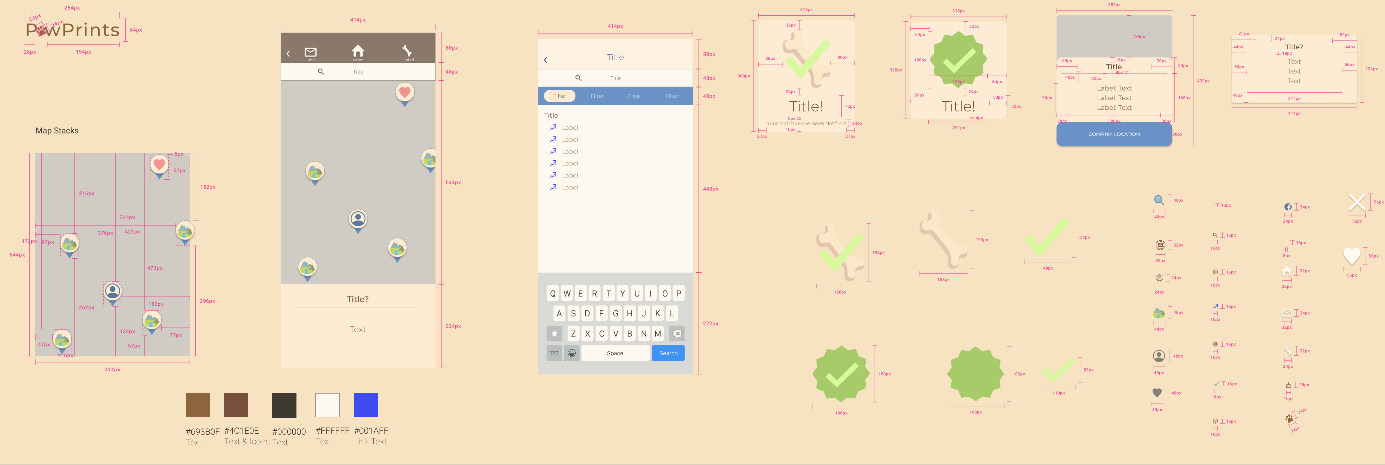
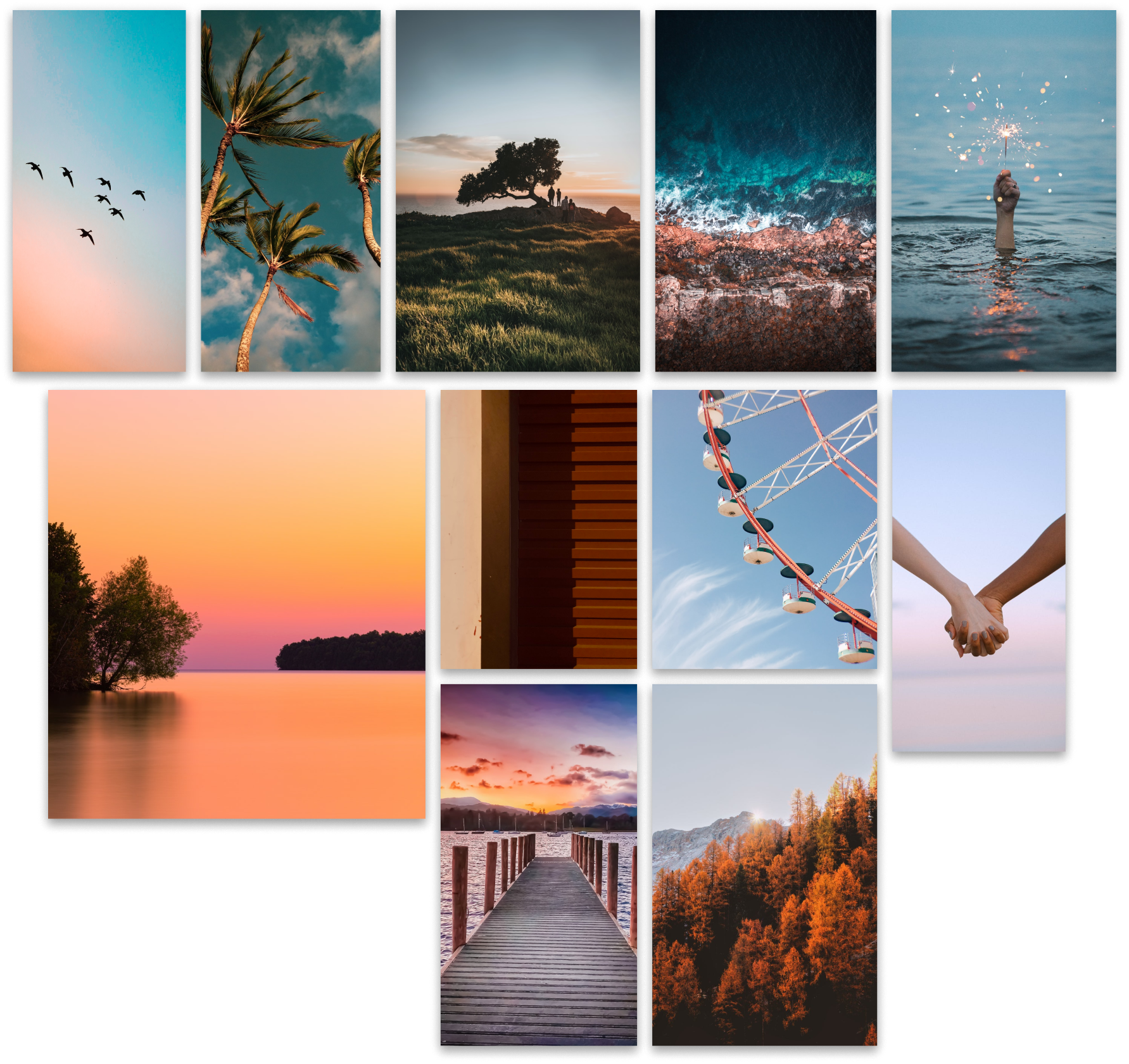
At this point of the journey I wanted to incorporate inspiring photos and build my brand for this project. I tested a few color options to bring the app to life that were extracted from the mooboard.
With the screens pulled, I recreated each individual section and translated them into a paper prototype using the Pop App by Marvel to get a general idea of whether or not it made sense.
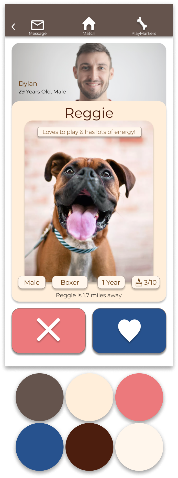
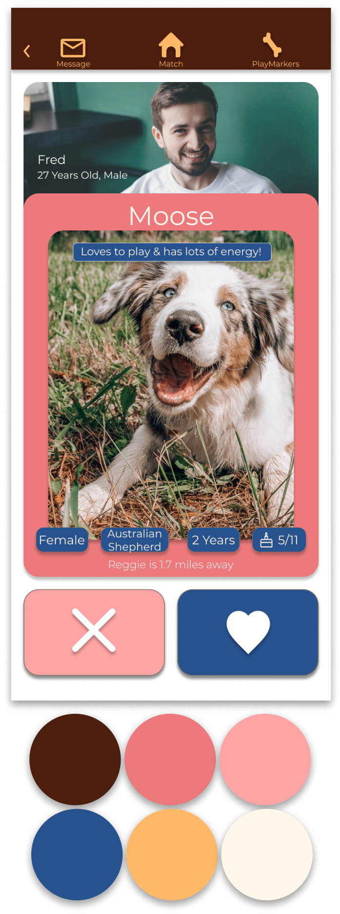
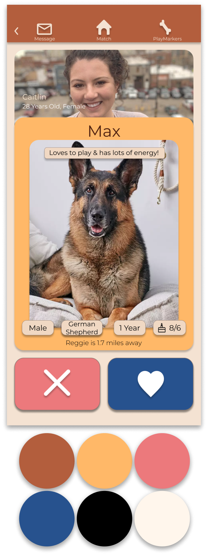
After creating different color concepts I created, I was able to decide on a pallete that best represented my visual identity and here is where the brand PawPrints came to life. Below are a few process images of the ideation of my brand.
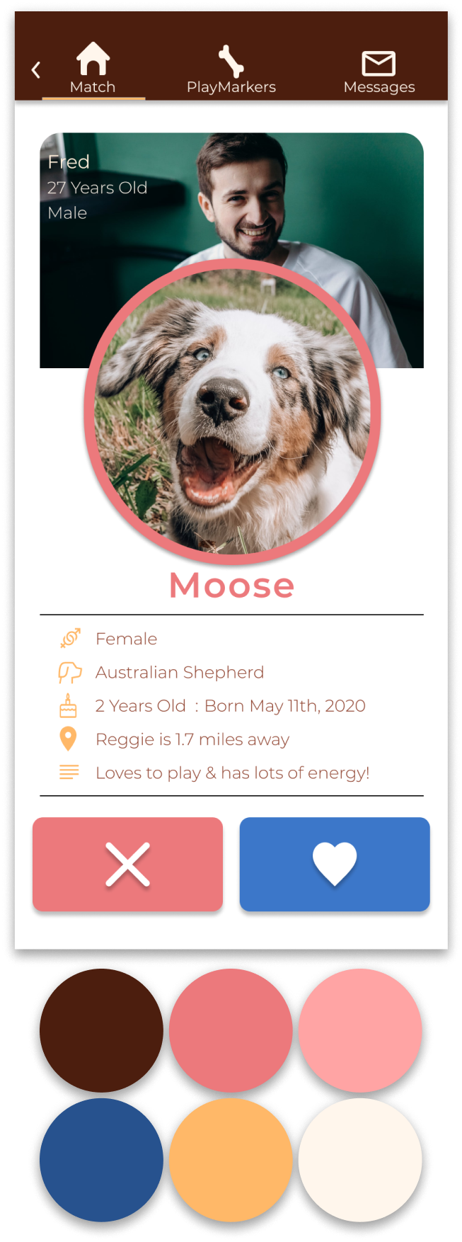


Exploration
Iterations of Menu Bars
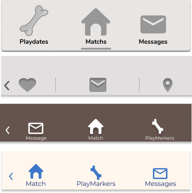
I chose to go with something more calm and structured. The menu bar is very important to most UI designs, and will be seen on most screens. Having a darker background and lighter text makes the buttons stand out.
Redesign of the Onboarding Process

Visuals are key and by emphasizing the progress of the user during onboarding, it makes the task flow more intuitive and will encourage the user to complete the task at hand.
>Iterations of Matching Page

I wanted the matching card layouts to be minimalist & still intuitive. I explored many different types of card styles, especially the effects to make it stand out. My decision was based on making the dog the main focus point.
Search bar map integration
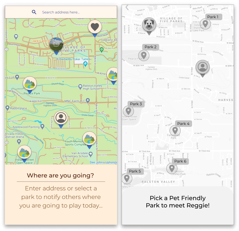
I chose to go with a map screen that has trails and roads to make it more obvious to the dog-owner where they can go. Adding a search bar is pivotal to any planning app due to it’s accessibility.
Exploration
As a designer of this app, I wanted the Brand Name to reflect the mood and feelings of the initial design.
I wanted the users to feel like they are at ease & are able to fully engage with the fun experience!
Exploration

Exploration


If I had to reimagine my app to be on another platform, what would it be? Tablet?
Looking back at the user interview sessions of my researching phase I knew dog-owners often do a lot of their research on a tablet.
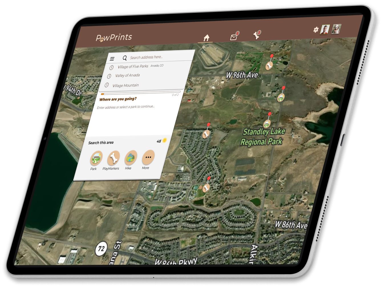
I chose to go with a map screen that has trails and roads to make it more obvious to the dog-owner where they can go. Adding a search bar is pivotal to any planning app due to it’s accessibility.
All platform requires a bit of a marketing push here and there - this is an exploratory creation for a responsive website to build the brand PawPrints.
The goal of this design is to inform the potential users what this app can provide the active dog-owner. The marketing website embodies the colorful and energetic value propositions of the brand & mobile design.


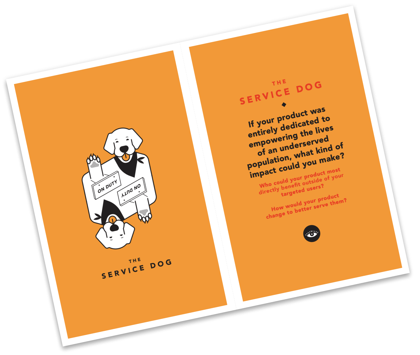
My classmates and I challenged ourselves in thinking outside of the box by randomly picking cards from “The Tarot Cards of Tech” deck and this was what I ended up with . . .
“If your product was entirely dedicated to empowering the lives of an undeserved population, what kind of impact could you make?”
My product will be suitable for all, including those that are underserved. However, if it were dedicated to empowering their lives, I could imagine the app being focused on allowing those underserved persons the ability to play with dog’s in the area. Having the PlayMarker’s focused on letting anyone play with, humans and dog’s alike.
I would do a deeper dive into what the pain points, motivation and behaviour the underserved population may have with the need to have social interactions with dogs. Their benefit could range from mental health to physical distress. I see a major benefit in expanding the scope of my project to include them as well.
Throughout the process of creating the PawPrints app, I formulated a strategy that I stuck with and was confident in the end result. However, I was still able to learn and grow by trusting the process I formulated, and from this trust, I was able to encorporate Human Centered Design principles. These principles are focused on empathy for the user and designing for their needs and pain points. These principles are not focused on what would make the most money, but more importantly, what would make the biggest impact on the user’s experience as a dog-owner.
I can’t express this enough, but being open to feedback is the most important aspect of being a efficient product designer. The amount of feedback I received from colleagues, design educators, friends & family, and most importantly, user testers, were the most significant components in creating an intuitive design. Without being open minded to feedback, I do not know how the reiterations of my design would have turned out. I would have been up creek without a paddle. Designing specifically for a target audience, and not for myself was a major component in the success of my design.
Looking back on this project, I wish I could have kept better track of time. I did learn a valuable lesson from it, which is, “Don’t be a pixel pusher!” The first time I heard this was during week nine of this project timeline and hearing it felt like they knew I was doing just that, making everything as pixel perfect as I could. Never a good scenario for a designer or for the user! Something I thought would take five minutes to modify would end up taking me hours. They probably had no idea that I had modified them. This time wasted could have been used to re-prioritize my design process and including different UI concepts all together. As a designer, everything won’t be perfect and thats the beautiful part of the whole process. As the Beatles have once said, “Let it be... Let it be...Speaking words of wisdom... Let it be..”