


For those of you that don't know, Presto is a card that citizens of Toronto MUST have in order to use the transit system. So, it's essential that its official app works perfectly but with a two star rating, we saw an opportunity to improve it.
The Presto card must be used to take transit within the city of Toronto. For this reason, the app must work flawlessly. However, with a 2 star rating in the app store, it is far from this goal.
The system should speak the users' language rather than system-oriented terms. Follow real-world conventions.
Prevent problems from occurring in the first place, or check for them and present users with a confirmation option before they commit to the action.
Minimize memory load by making objects, actions, and options visible. Instructions should be visible or easily retrievable.
Users often make mistakes and need 'emergency exits' to leave the unwanted state. Support undo and redo.
Dialogues should not contain information which is irrelevant or rarely needed.
Users shouldn't have to wonder whether different words, situations, or actions mean the same thing. Follow platform conventions.
The system should keep users informed through appropriate feedback within reasonable time.
Each heuristic is given a rating from 0-4 based on this image below. Each of these ratings are put on a prioritization matrix to decide which problems to fix first.

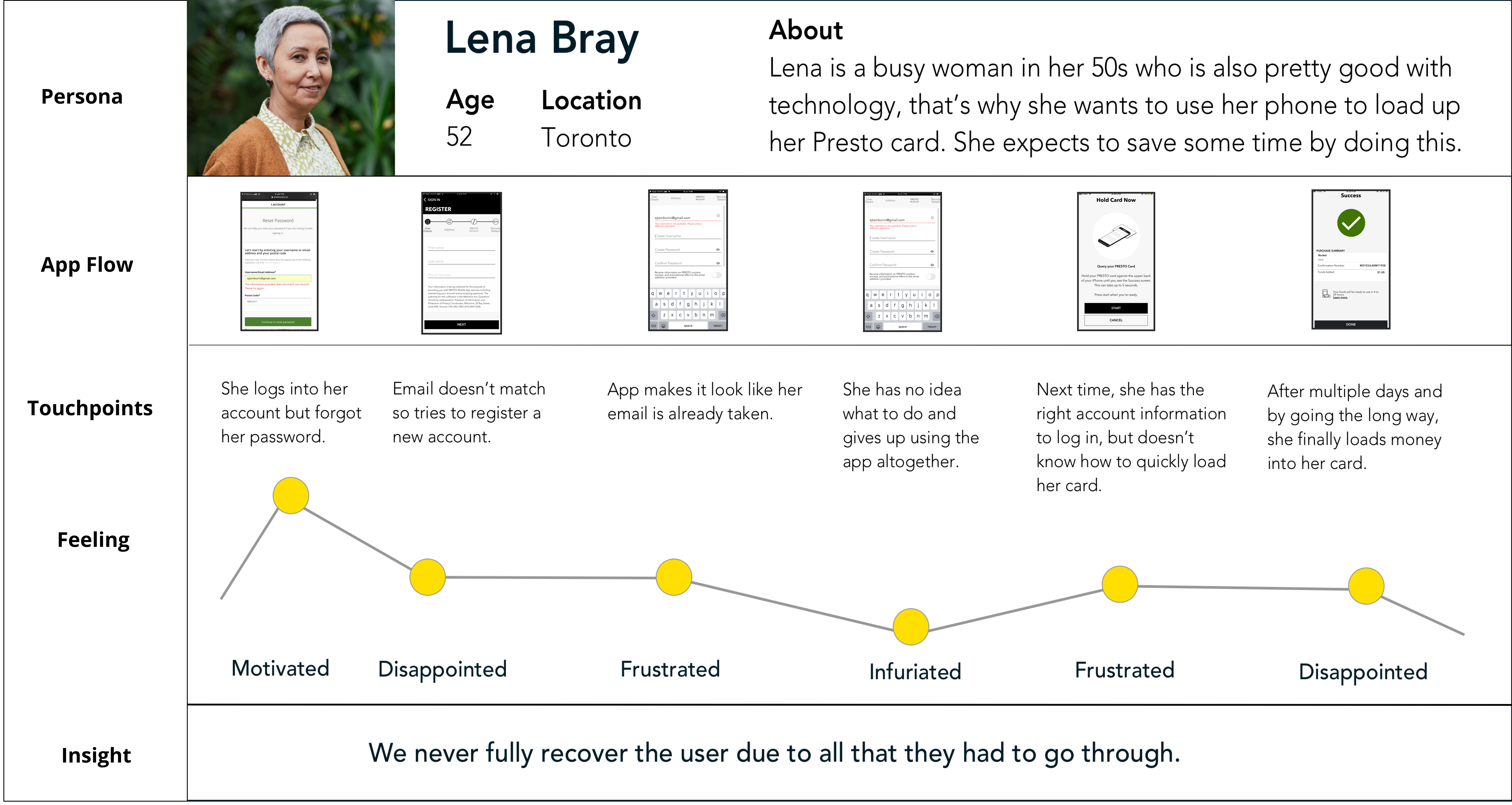
Before rating the app flow, let's consider the average user Lena Bray.
To better illustrate our journey, we want you guys to meet Lena. Lena is in her fifties but she's still pretty tech savvy. She's busy and on the go, so she wants to be able to load her Presto card so that she can quickly prepare for her commute.You can imagine that she logs into her account but doesn't remember her password, however resetting it becomes confusing and in the end she gives up all together. When she tries it again sometime later, she was able to make it work but the app didn't work when she needed it the most. So let's get into how this journey can be improved.

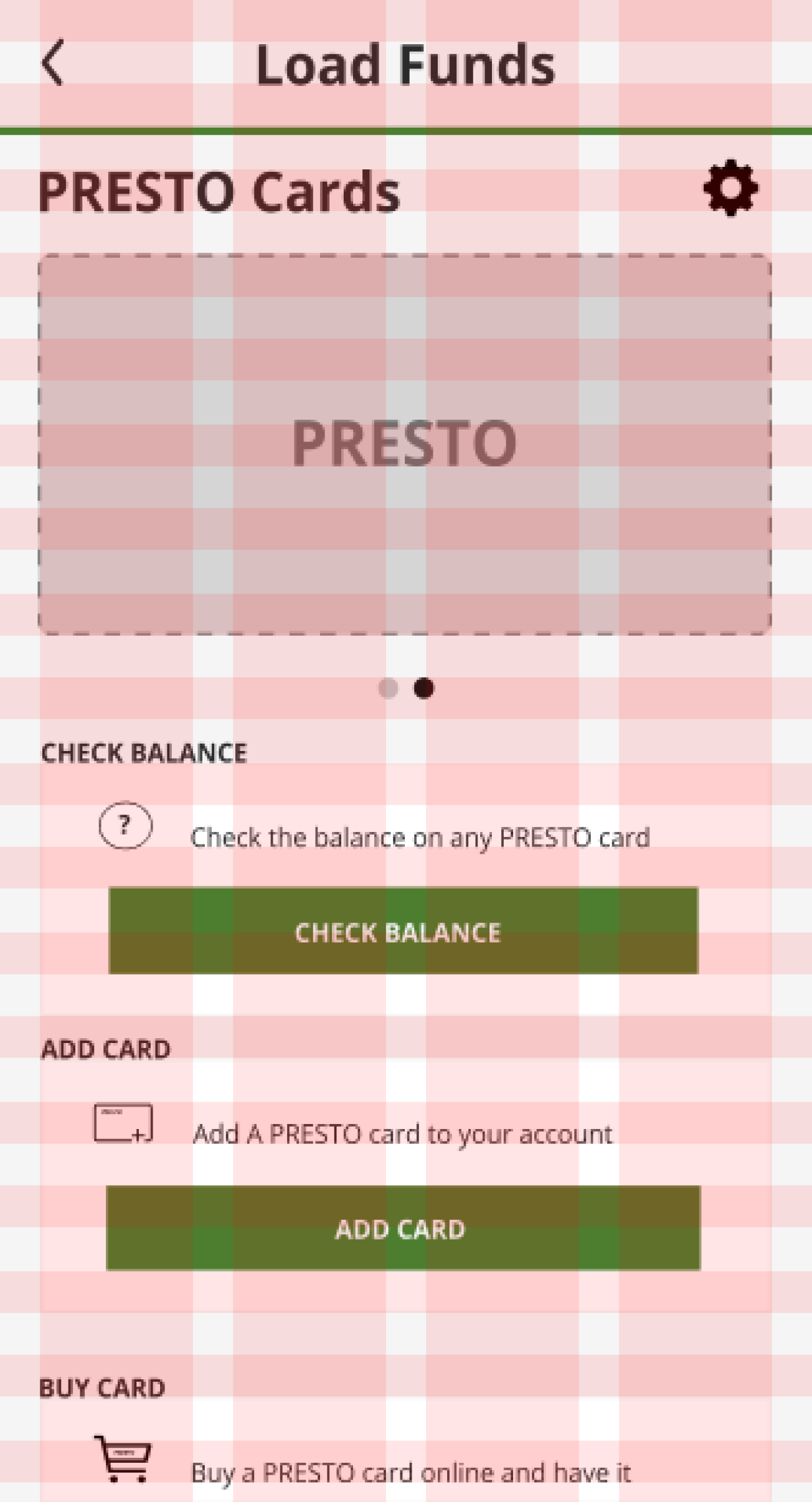
We used grids to align every element and create harmony.
We also borrowed colors from the website to create more consistency for the user and the brand.

Users seldom have a need to read this long-winded terms and conditions prompt.
Allow users to read the detailed terms and conditions if they choose to by clicking “Learn More”.


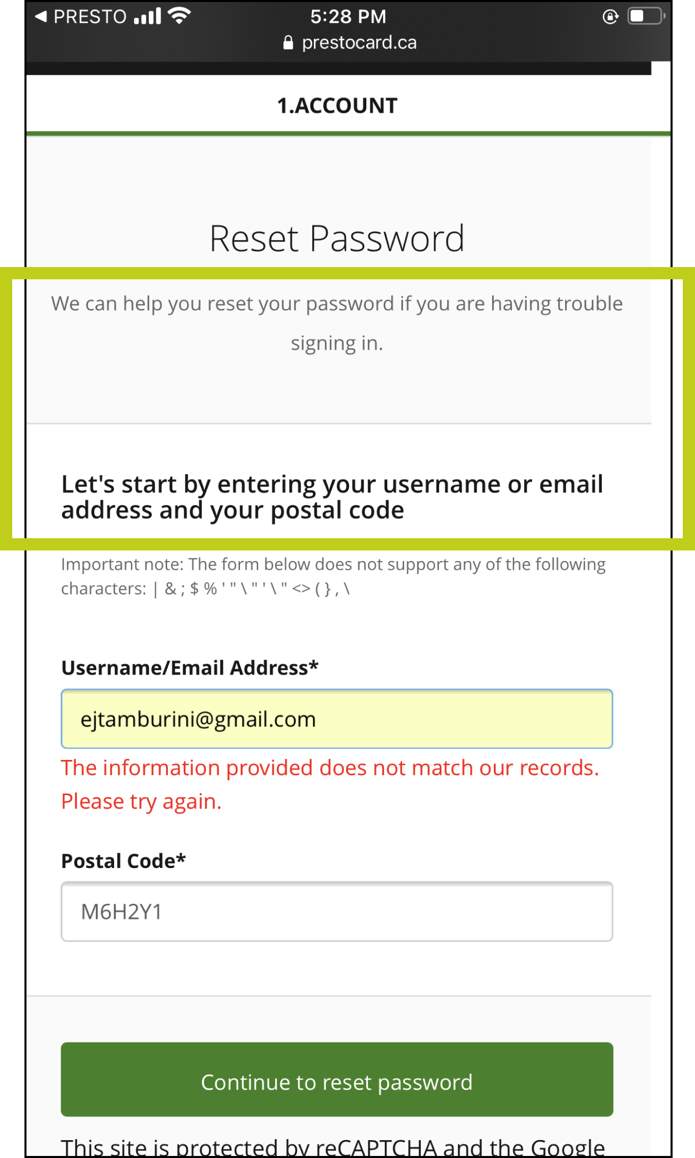
The requirements to reset your password required a postal code and there is no back button from this page.
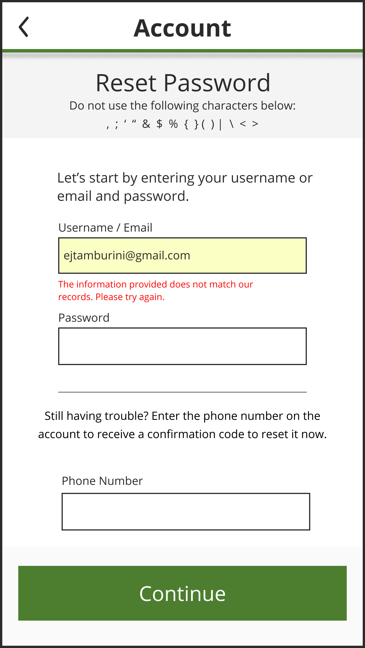
Allows the user to reset their password without a postal code, and the user has an emergency exit CTA.

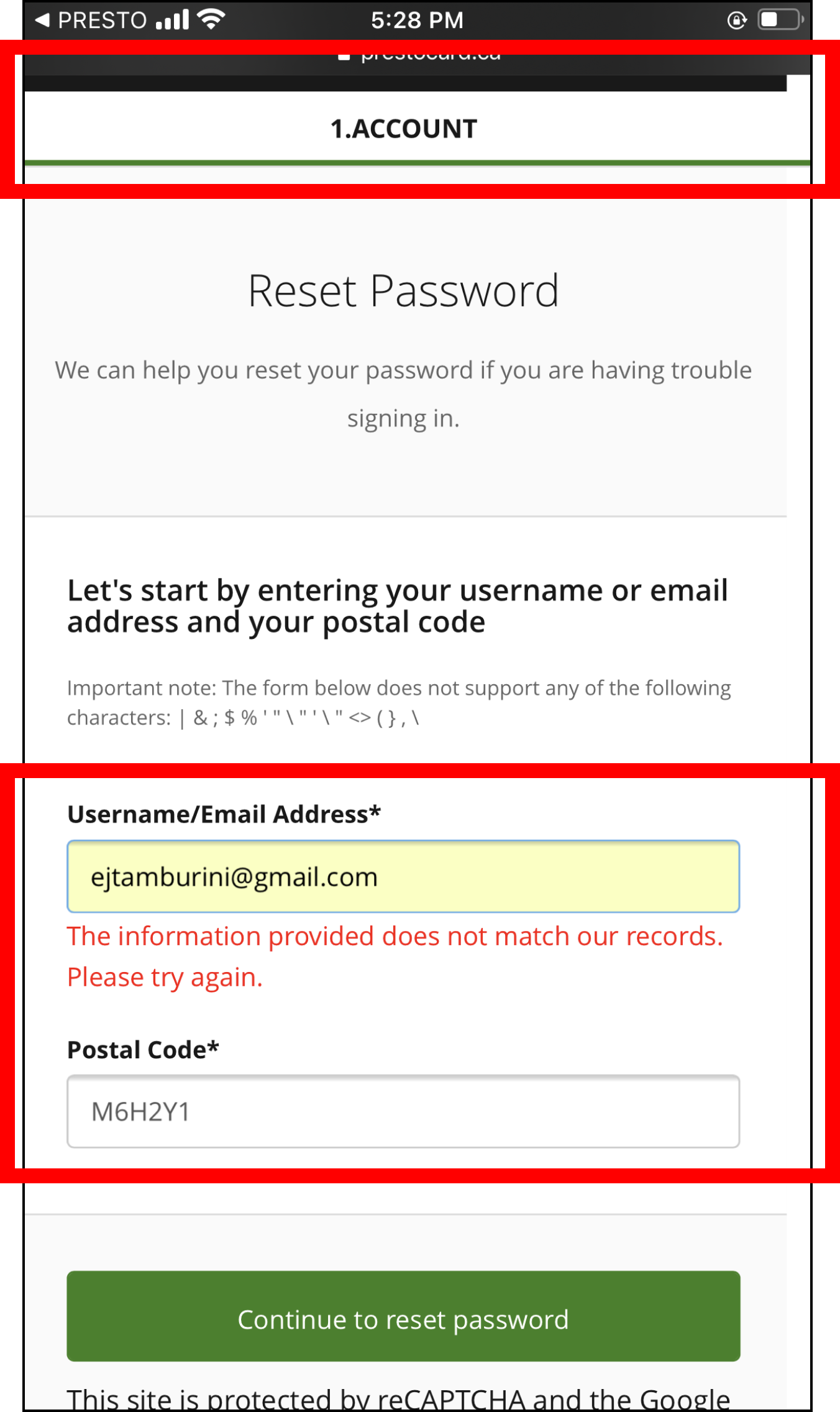

The form indicates that they do not support specific characters for the username.
Positioned the form to be more accessible to the user. Increased the font size and spacing of characters.

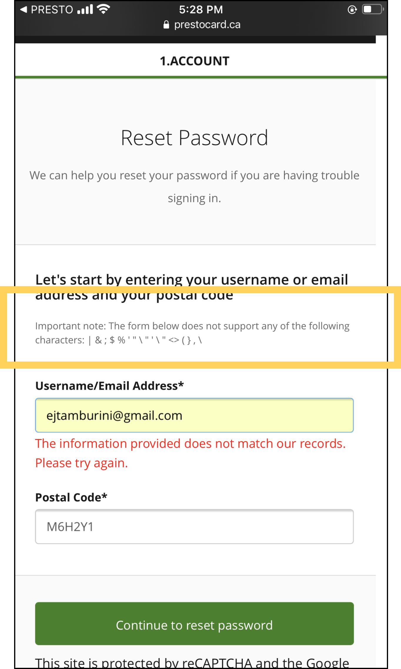
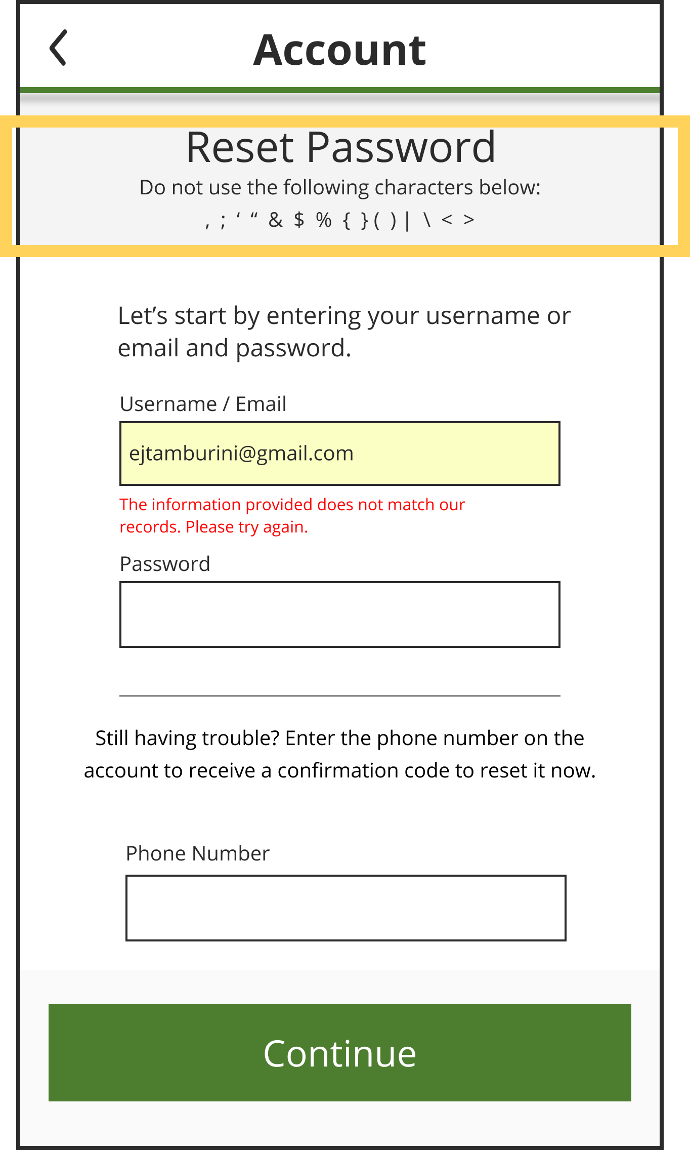

The information below Reset Password is unnecessary & the additional help should appear after the error occurs.
Minimized the information before encountering an error & added a second alternative to help the user reset their password.



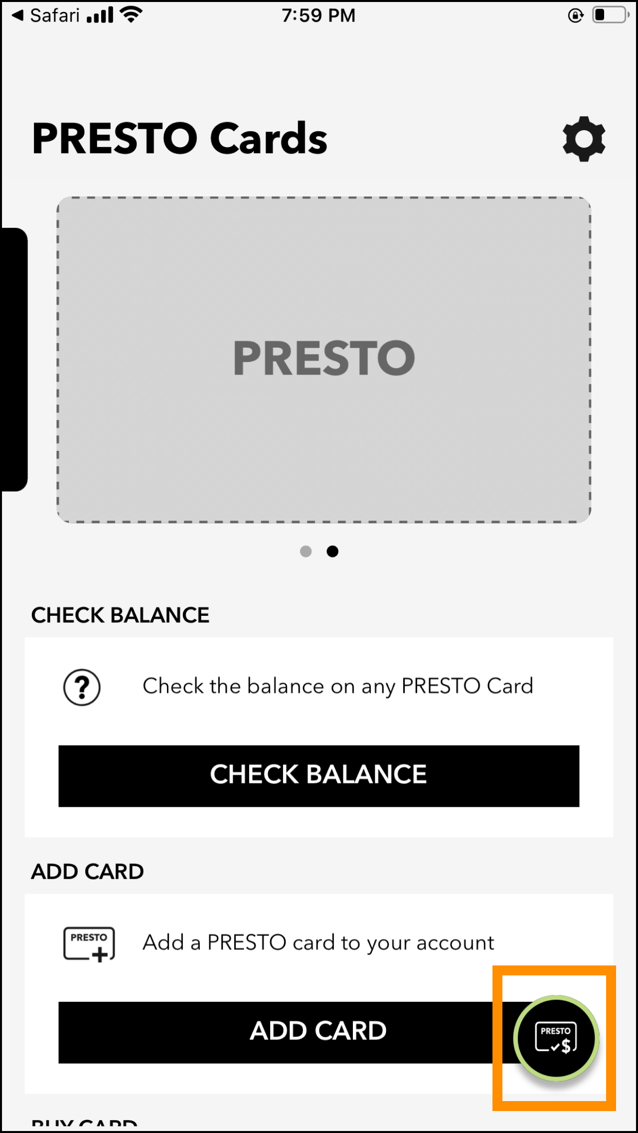
It’s not clear what this button does at first. The user will likely still not be sure what it does after tapping on it.
Removed the redundant button and updated the copy so that it is more intentional.



This doesn’t look like a button, but the user has to press it to advance to the next page.
The field is now a button, so it is clear that the user needs to interact with it to move on to the next phase.


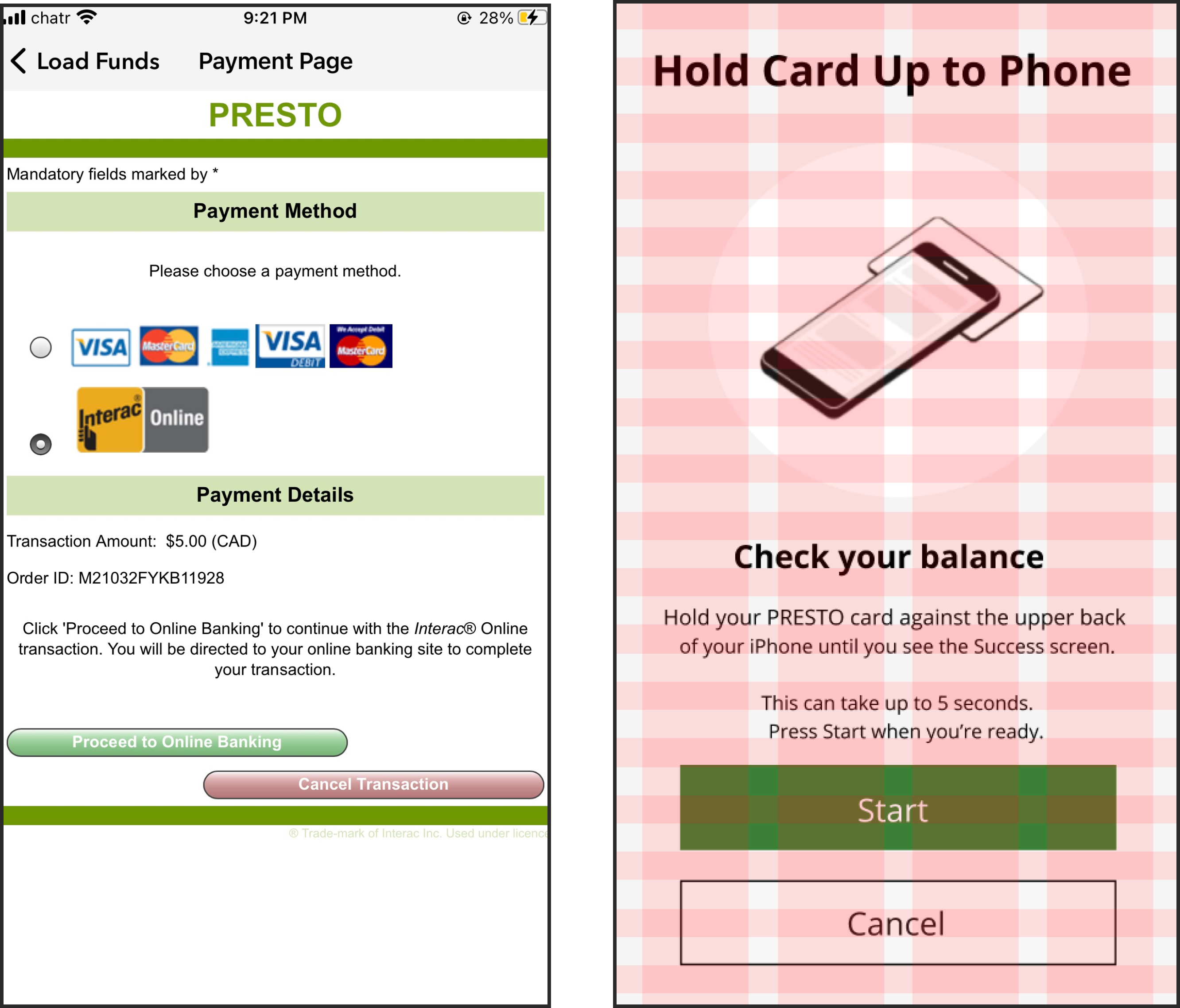
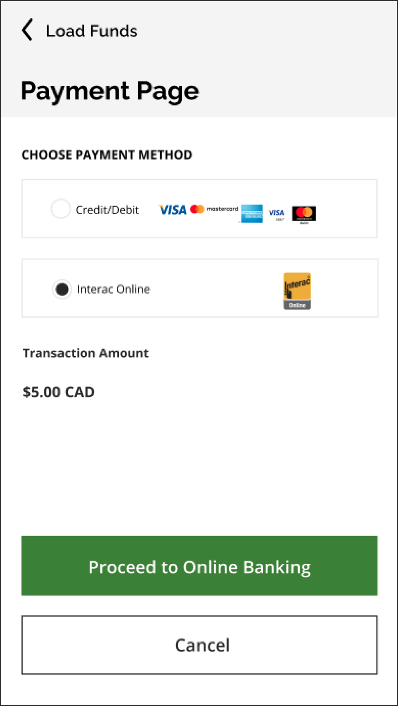
Does not follow the platform conventions. It takes you off the app when adding alternative payment details, and the page itself is not designed for mobile phones.
Add an Interac payment details page to the Presto App itself.


“Mandatory fields marked by *” is unnecessary because none of the fields on the current screen are actually marked by an asterisk
Delete all of the subtext below Presto, Payment Methods & Details. Also, change “Payment Method” to “Choose Payment method” to reduce confusion.



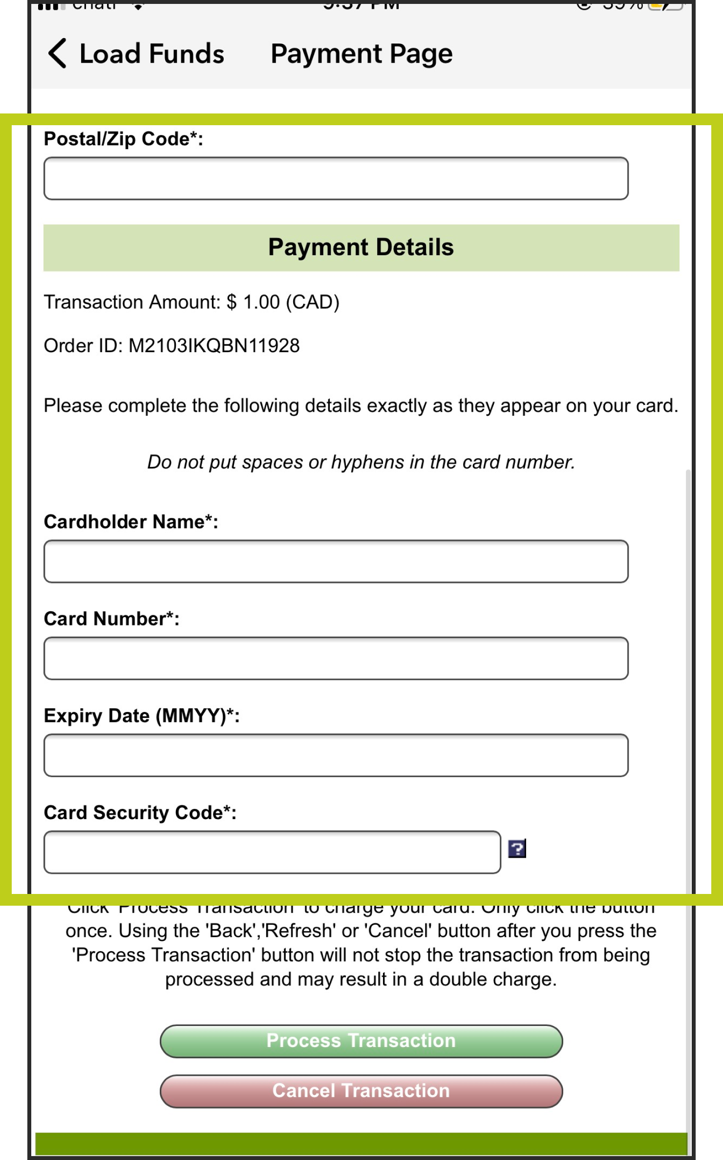
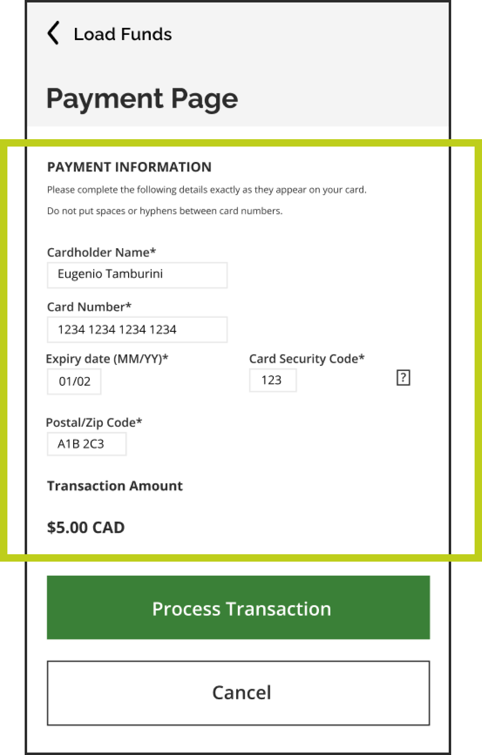
To load funds, the user must re-input their credit card information, even though they’ve inputted it in a prior screen.
Instead of asking users to recall data, provide an auto-complete option.


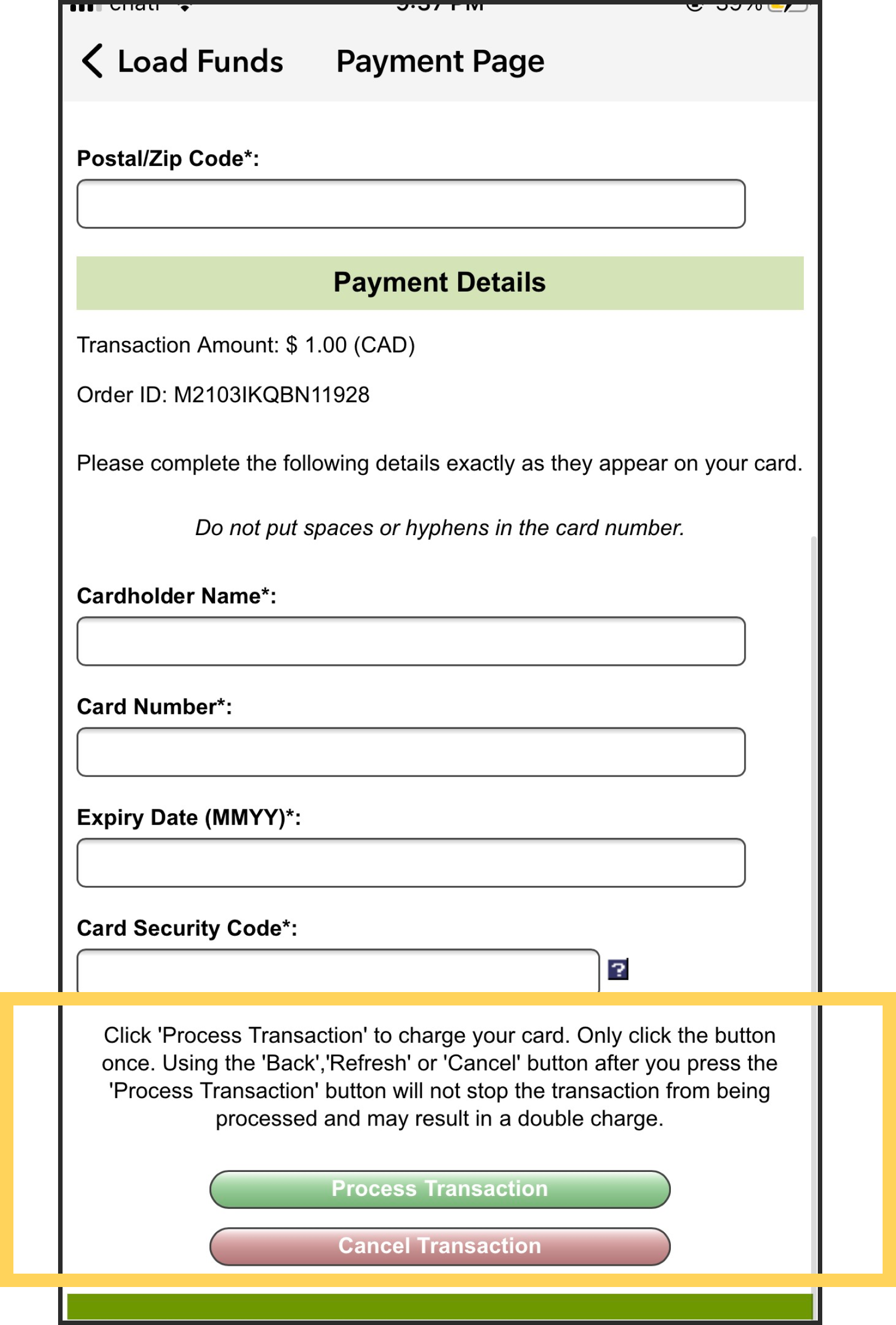
There should be no margin for error in the user hitting the “process transaction button”
Configure the button’s backend so that there is no margin for error for users when hitting the button more than once.

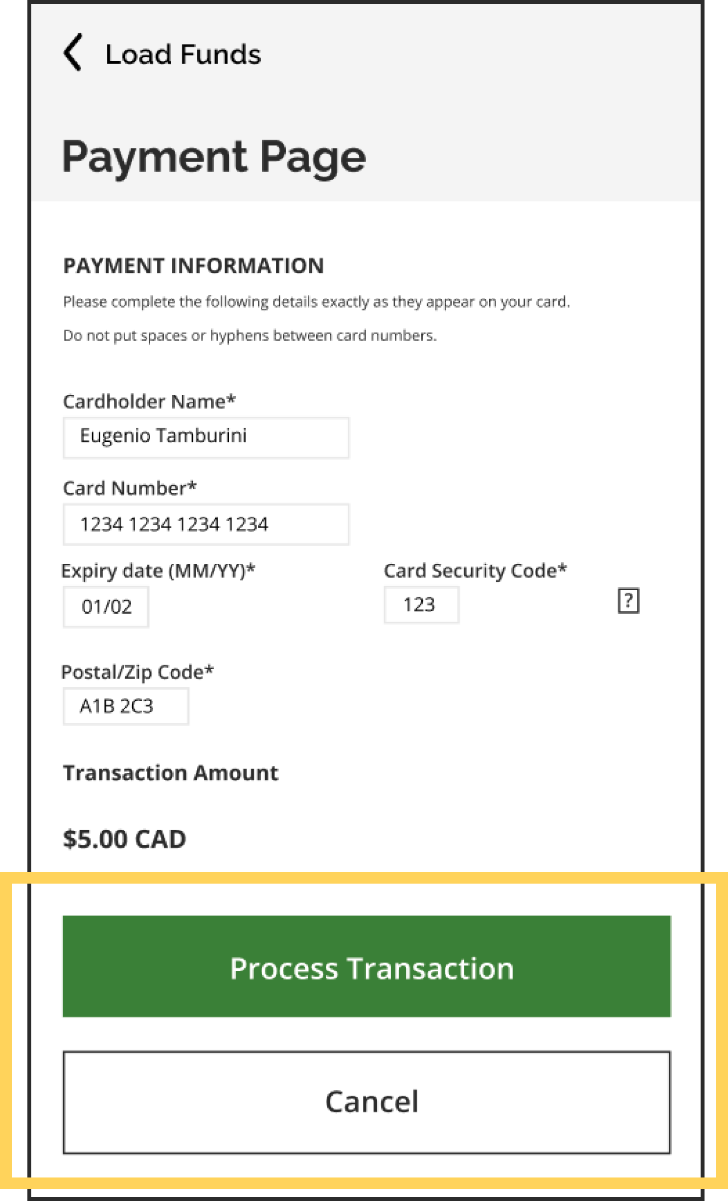

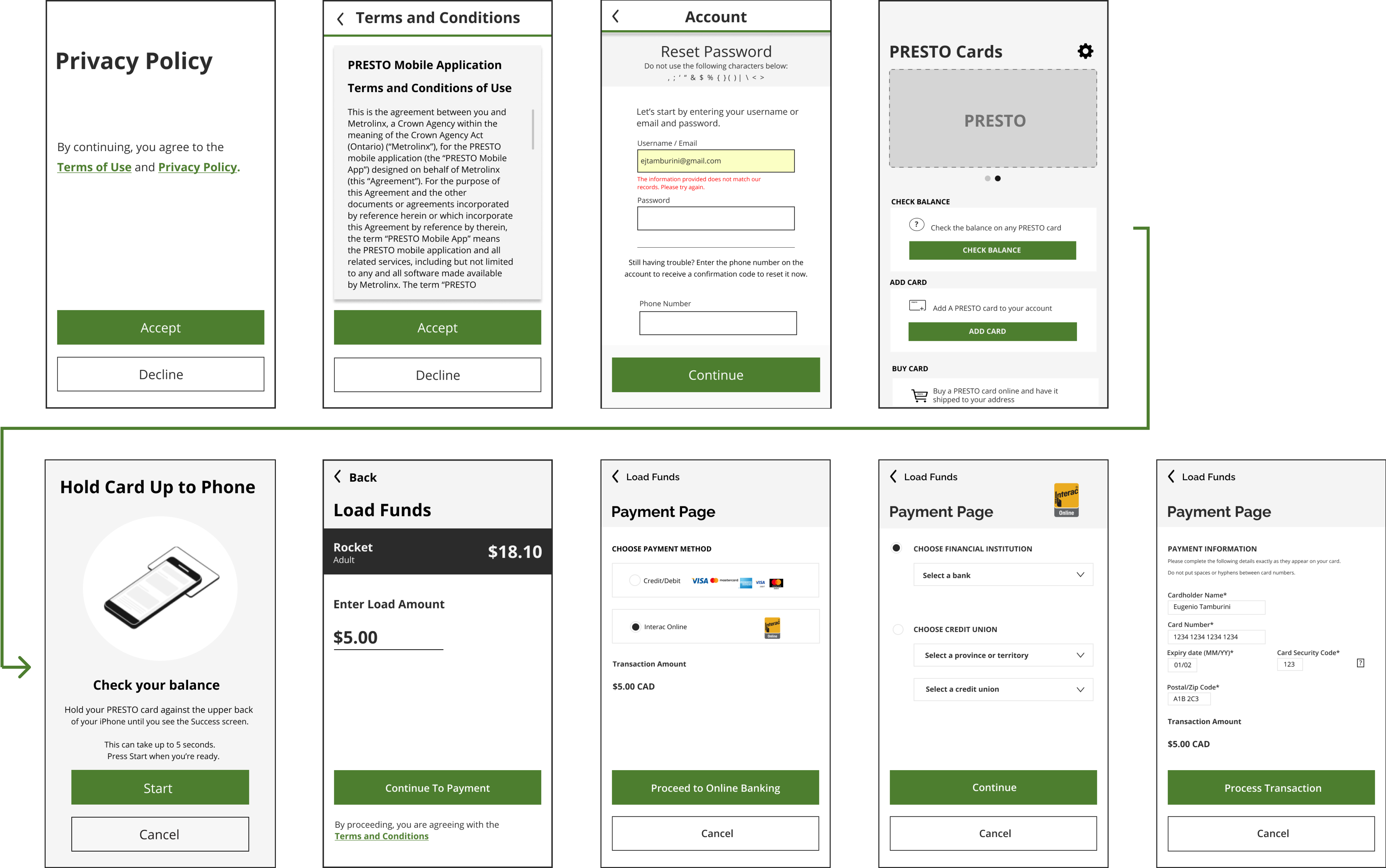
These changes have directly enhanced the overall experience of the app’s original goal for users: To quickly load the presto card. The value offered to Presto's users relative to the effort put into implementing these changes was very high. After comparing with other transit apps, the redesigned Presto app has the potential to be one of the most intuitive transit apps in Canada.
The rest of this study will explain in detail the UI library created for this redesigned app. The UI library is organized by the fundamentals, atoms, molecules, organisms, and then templates/pages.
Atomic Design was developed by Brad Frost and it helps us categorize UI elements from their most fundamental stage to a complete page.




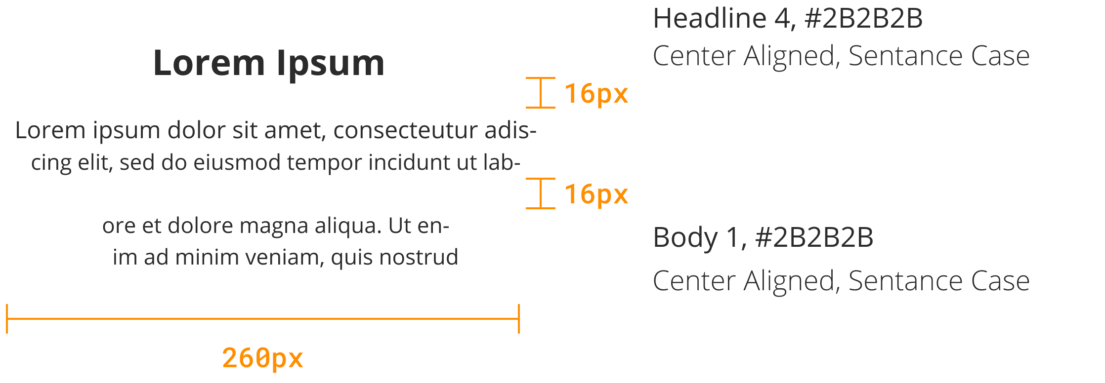












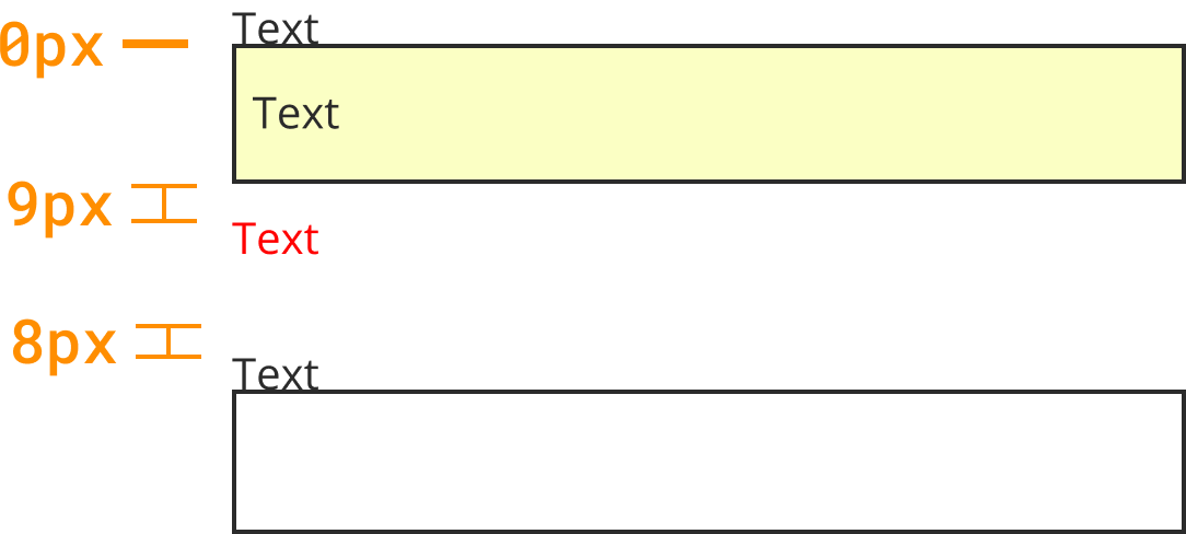





Atoms / Privacy Title
Atoms / Body 0
Atoms / Link Text
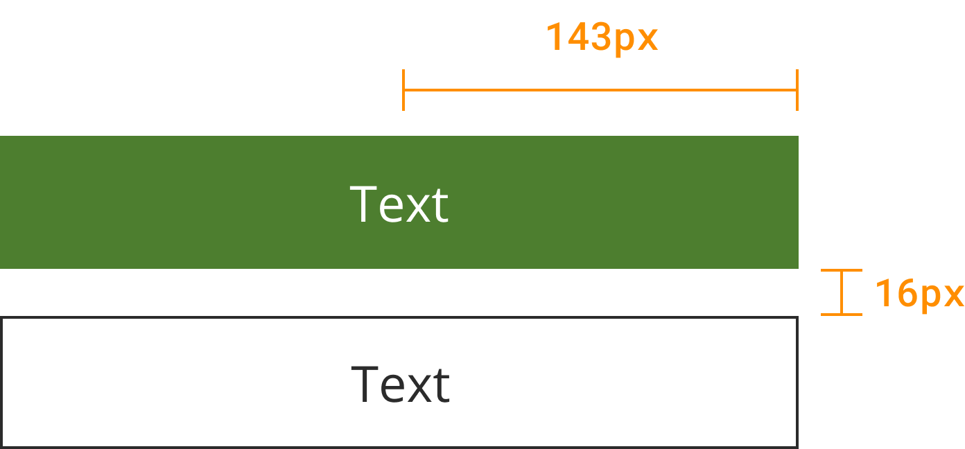
Molecules / Button Stack

Atoms / Standard Top Bar
Atoms / Main Divider
Atoms / Privacy Title
Molecules / ToS Card
Molecules / Button Stack
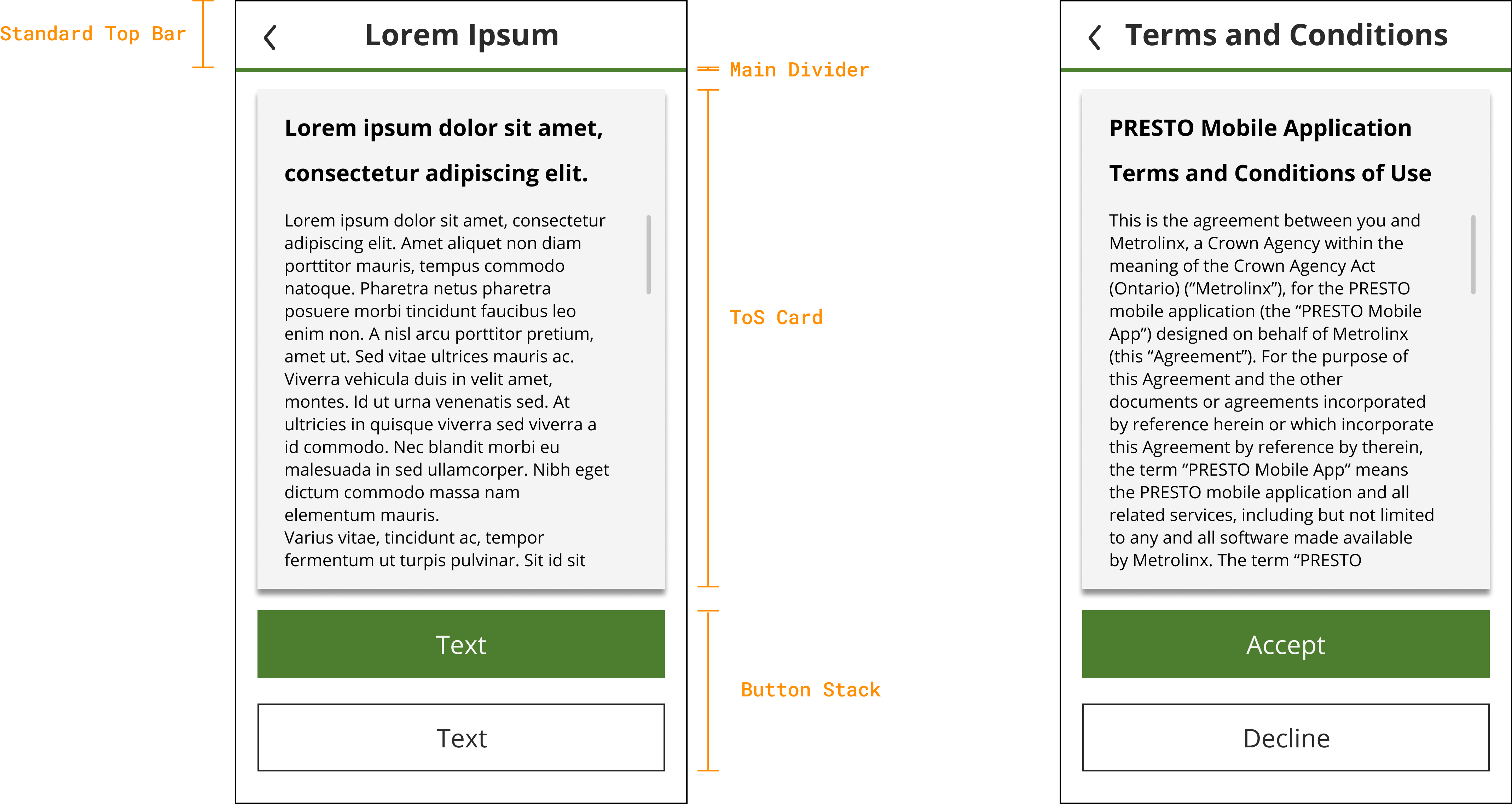
Atoms / Standard Top Bar
Atoms / Main Divider
Molecules / Instructions Prompt
- Atoms / Header 3.5
- Atoms / Body 1
Organisms / Sign in Table
- Atoms / Login Field - Error State
- Atoms / Body 2
- Atoms / Log in Field - Blank
- Atoms / Page Divider
- Atoms / Body 2
- Atoms / Log in Field - Blank
- Atoms / Large CTA

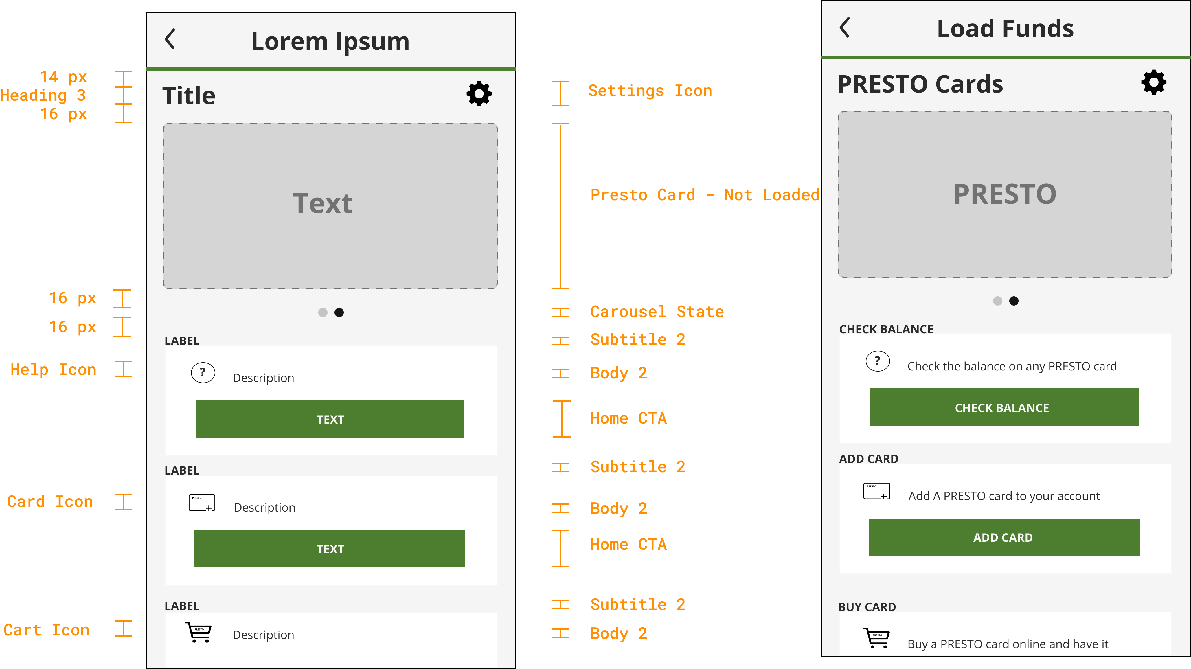
Atoms / Standard Top Bar
Atoms / Main Divider
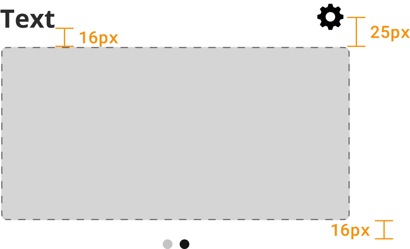
Atoms / Heading 3
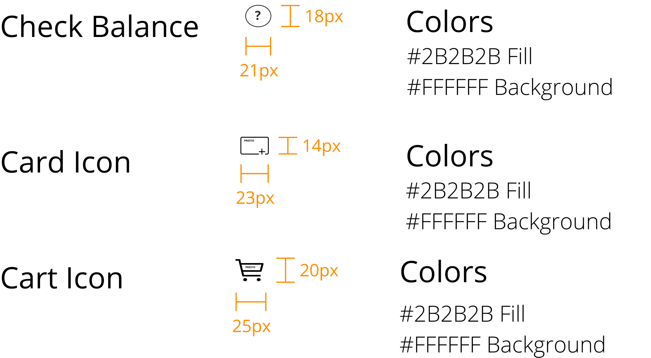
Atoms / Settings Icon
Atoms / Presto Card - Not Loaded
Atoms / Carousel State
Atoms / Subtitle 2
Atoms / Body 2
Atoms / Help Icon
Atoms / Card Icon
Atoms / Cart Icon
Atoms / Home CTA
Organisms / Card Loading
Atoms / Standard Top Bar
Atoms / Main Divider
Atoms / Heading 3
Atoms / Load Card Image
Atoms / Heading 4
Atoms / Body 4
Molecules / Button Stack

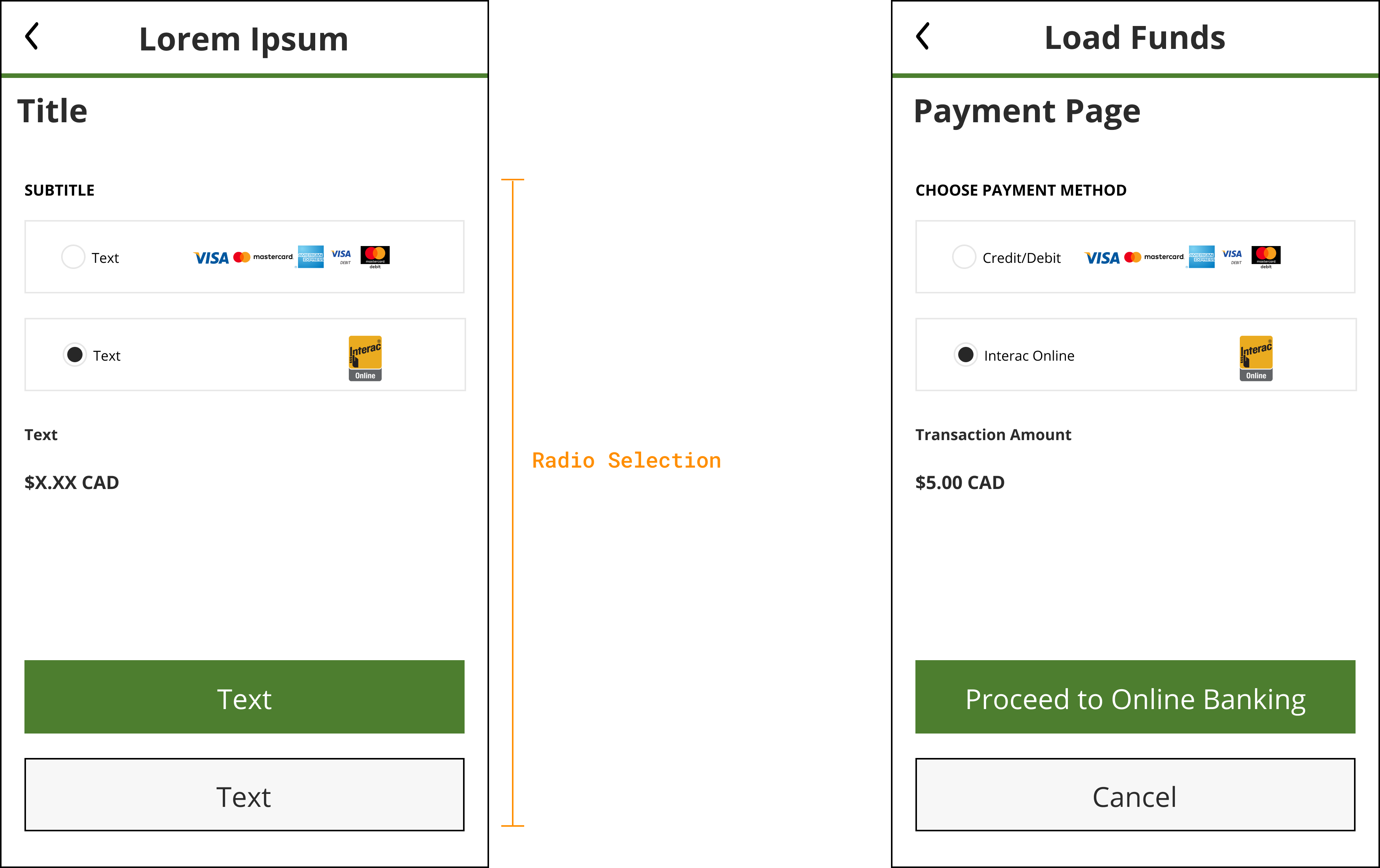
Atoms / Standard Top Bar
Atoms / Main Divider
Atoms / Heading 3
Organisms / Radio Selection
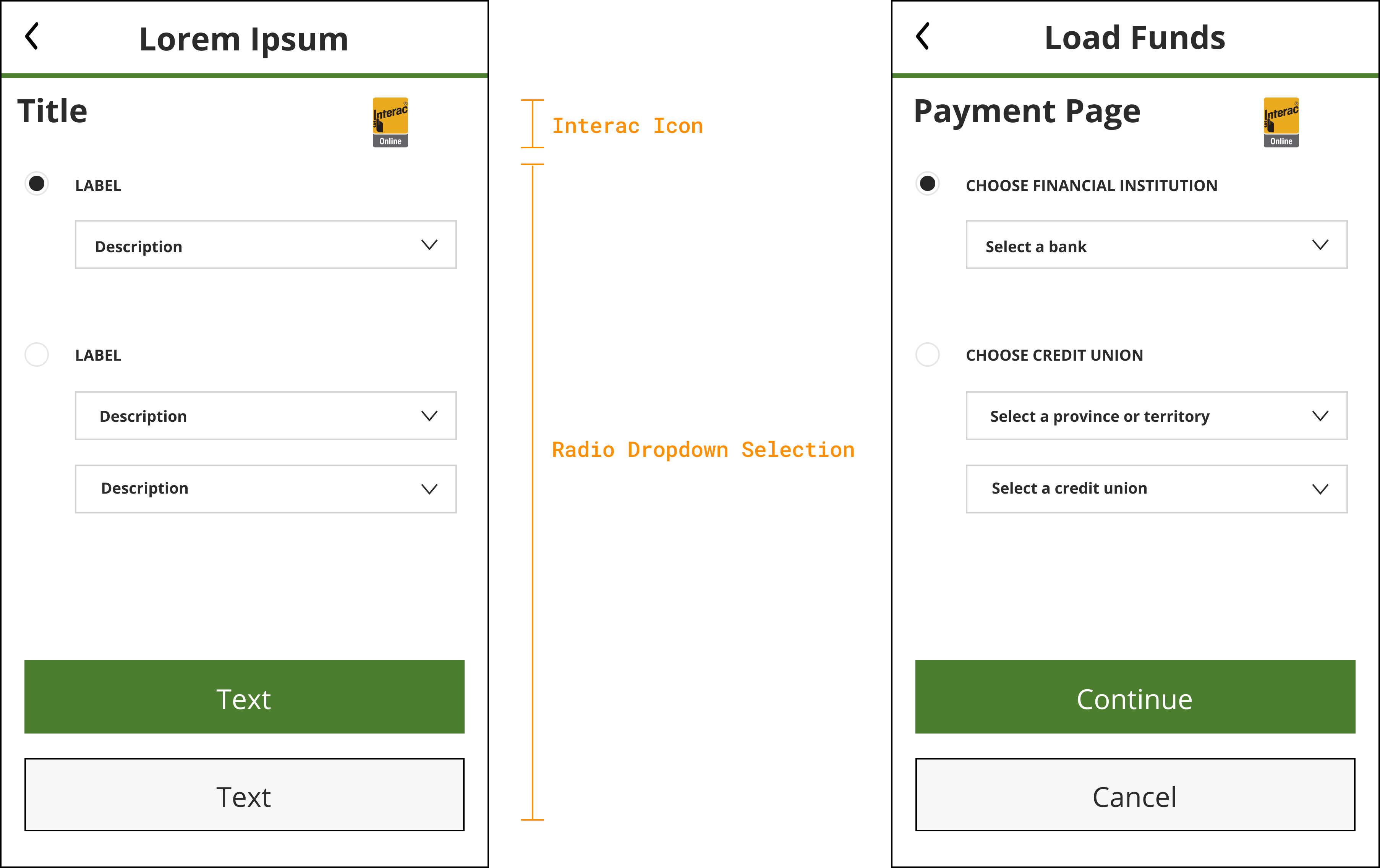
Atoms / Standard Top Bar
Atoms / Main Divider
Atoms / Heading 3
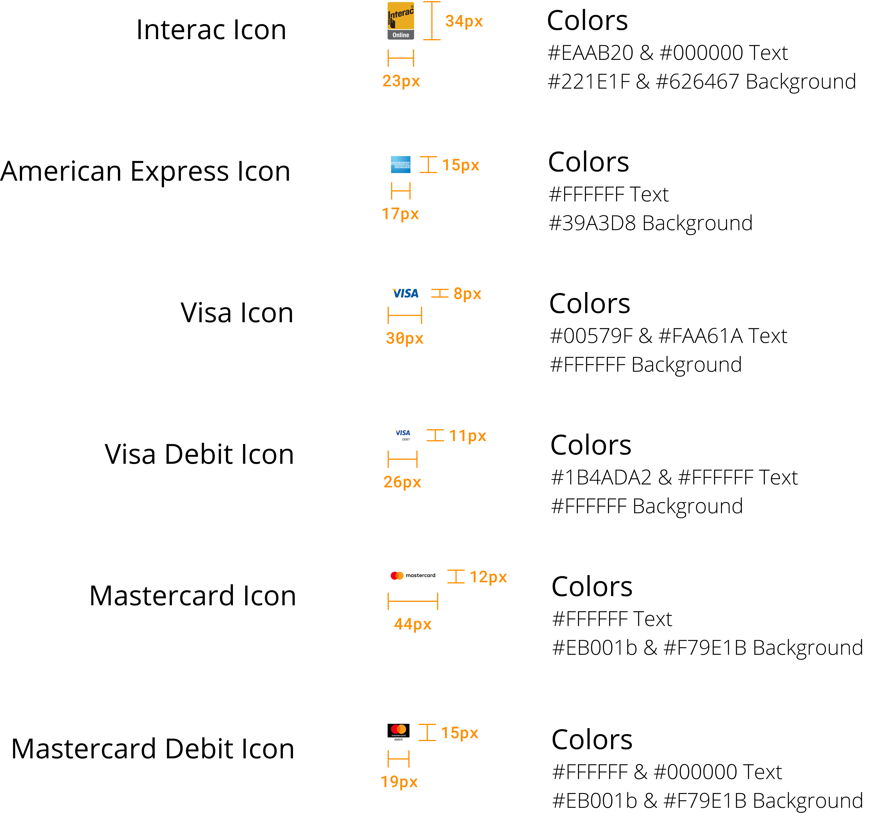
Atoms / Interac Icon
Organisms / Radio Dropdown Selection
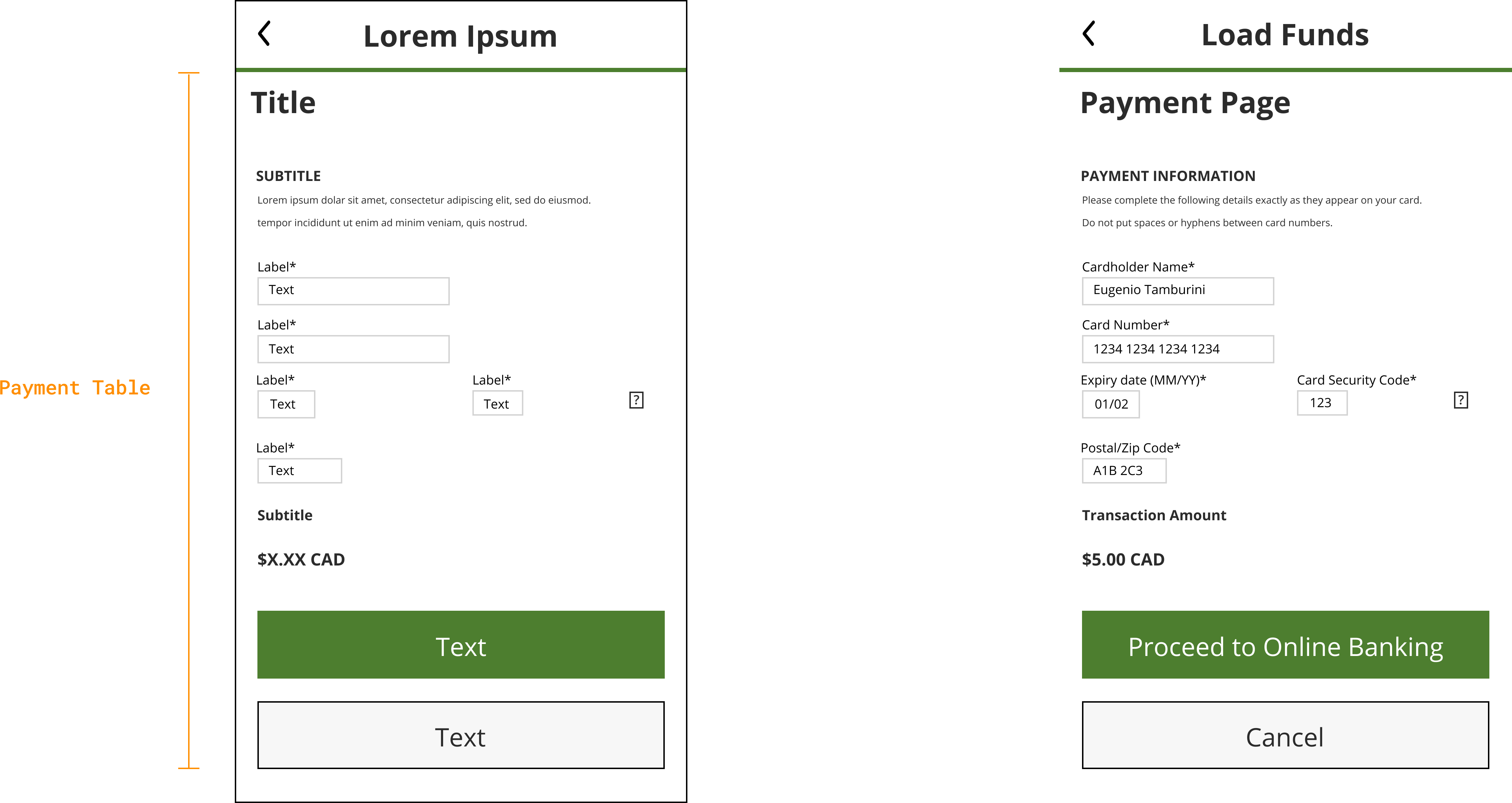
Atoms / Standard Top Bar
Atoms / Main Divider
Organisms / Payment Table
Atoms / Heading 3
Atoms / Subtitle 2
Atoms / Payment Description
Atoms / Help Icon
Atoms / Body 3
Atoms / Subtitle 1
Want to learn more about my design process or see what else i've created?