


it's a start is app designed with Google Material Design Icons & muted Google brand colors for a Google Hackathon hosted by BrainStation.
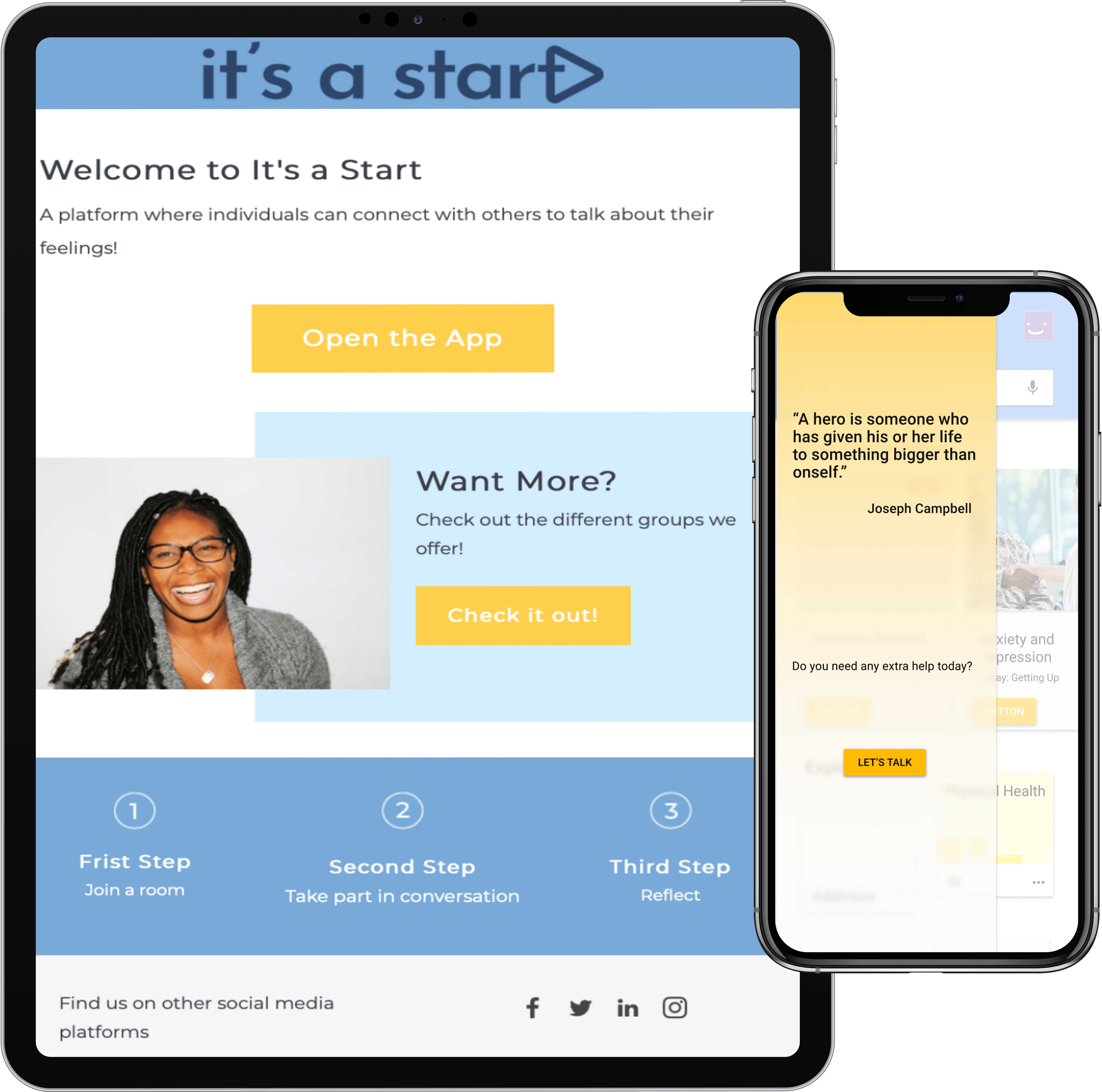
A 24-hour collaborative hackathon hosted by Google & BrainStation had teams consisting of 4 different disciplines create a digital solution focused on accessibility of health care services.
"The experience is about flexing the skills you have developed to date, learning new concepts from peers, and practicing communication and remote work within cross-functional teams. More than anything we are preparing and building skills to succeed in the future of work." - Google
Over an intensive period of brainstorming, discussion, and iteration, your multidisciplinary teams will create a digital solution that will empower individuals or communities to access health care services. The problem space: By empowering communities through access to information, education, and digital tools in collaboration between Brainstation and Google how might we create meaningful solutions to improve our communities' access to health care services? Reformulated HMW: How might we increase access to, or accessibility of, health care services through the use of education & digital solutions?
My Team: We Care spent the first 4 hours of the 24 hour collaboration ideating and discussing different possible solutions to the given problem space. We all had great & unique ideas initially but after further communication with the data scientists, marketing team, & web devs we were able to decide the focus of our design.
The data scientist were given multiple data sets involving mental health in the US & Canada. They assessed the data and reported that suicide rates across the US have increased over the past 20 years, and by designing a solution for that demographic, it will be utilized by a major portion of that population.
We decided to focus our design on helping different communities within that population.


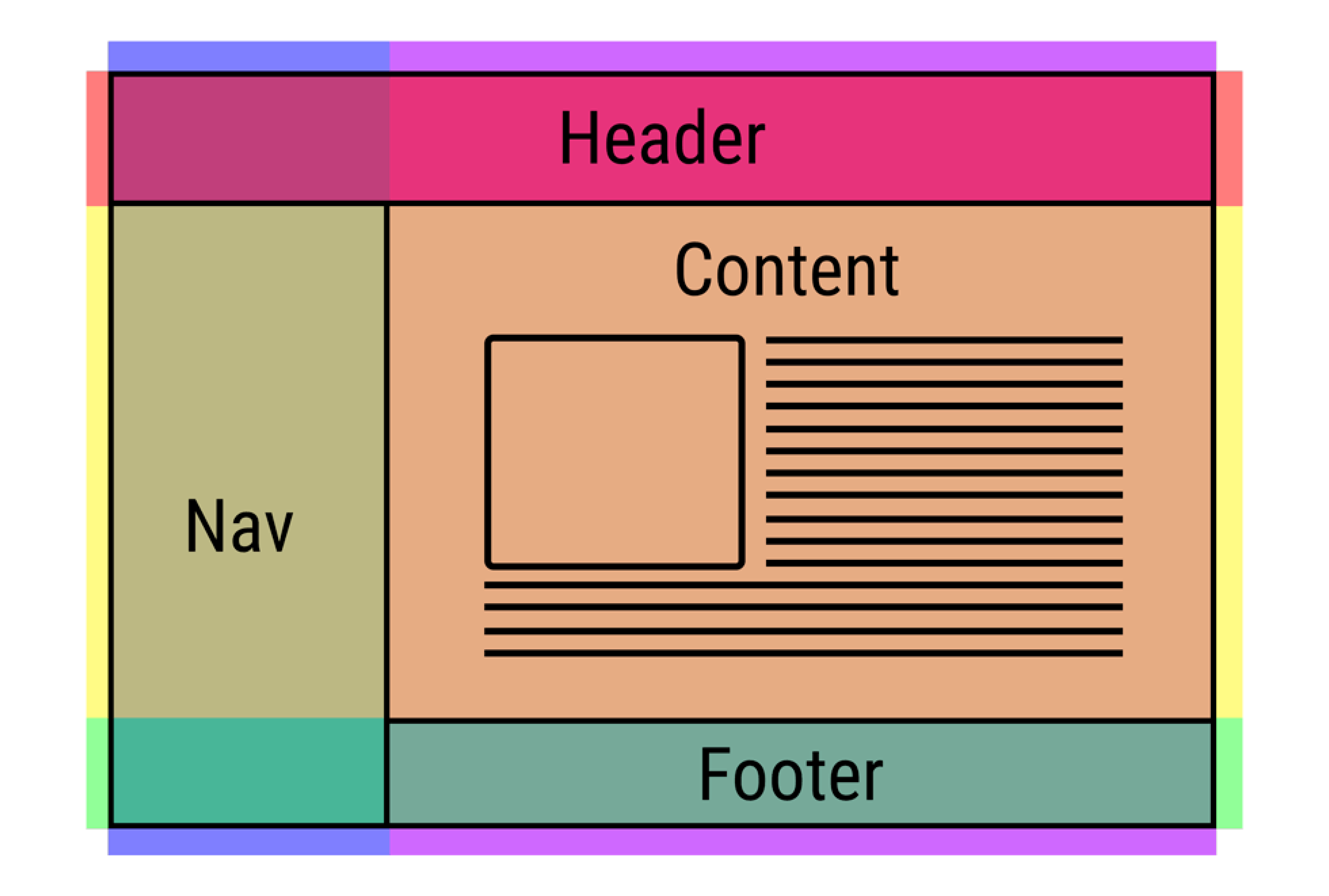
We designed these wireframes as a team and collaborated with the web devs to organize a brief template of what we intended the digital product to look like. We integrated the web devs sketches and further translated the ideas into lo-fi digital wireframes.
From these wireframes we discussed it as a team and realigned the scope of what we wanted to create. Further iterations were done and the wireframes were then approved by the entire team.

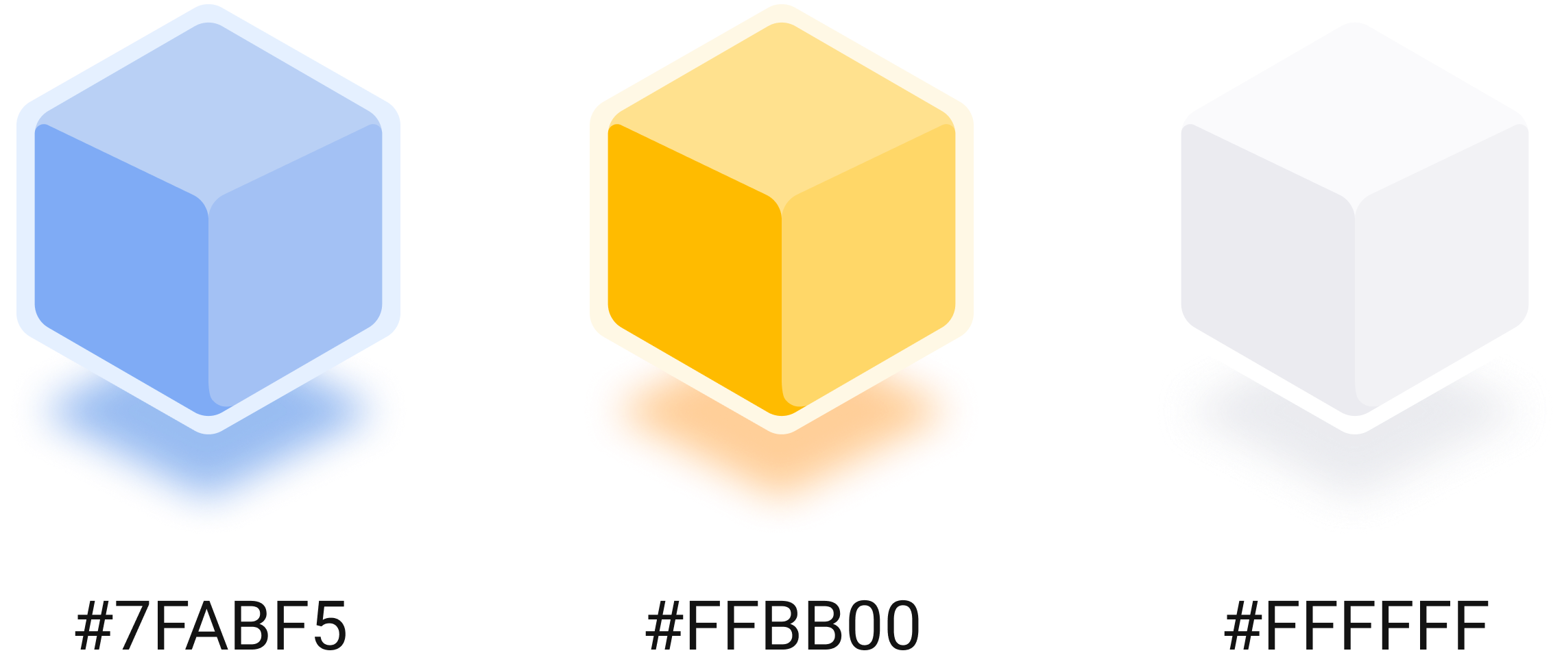
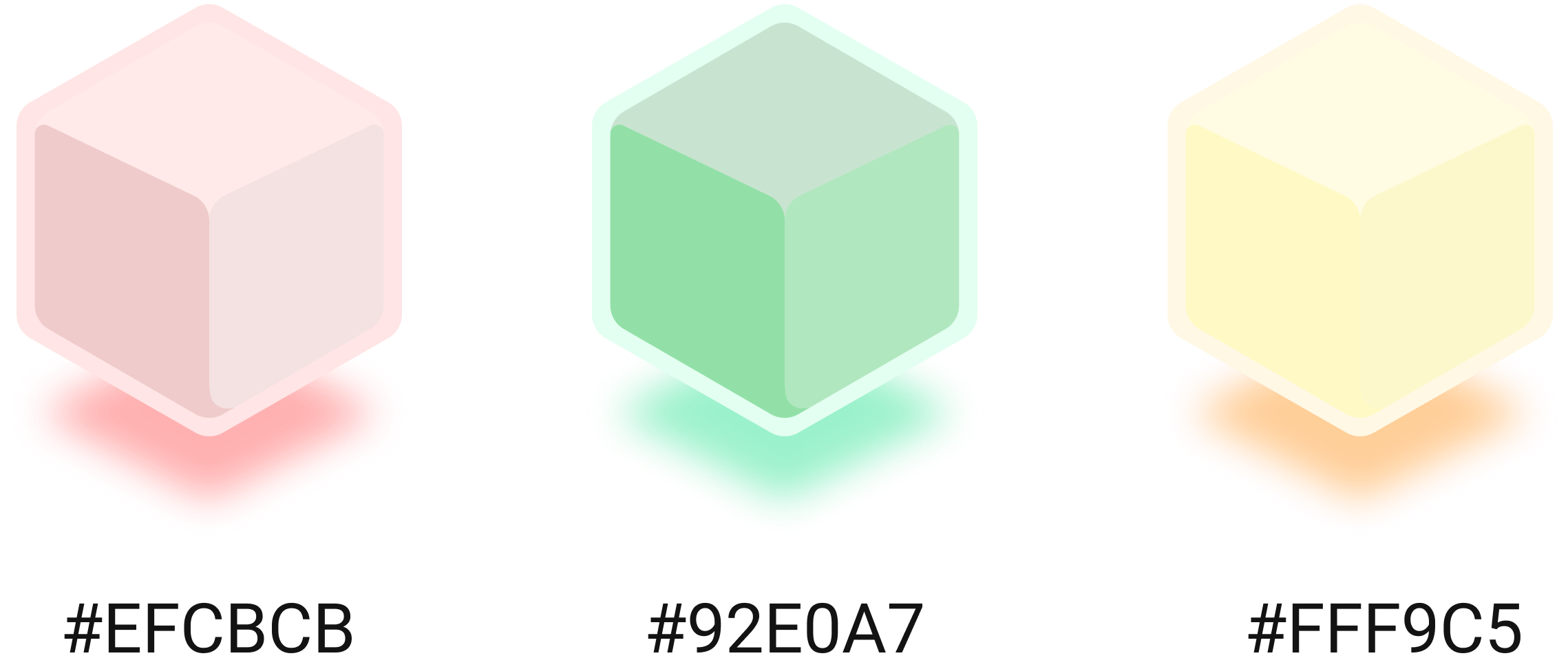
For the interface design we wanted incorporate the google brand but we modified the bold colors to more muted ones to invoke a calm and muted atmosphere.
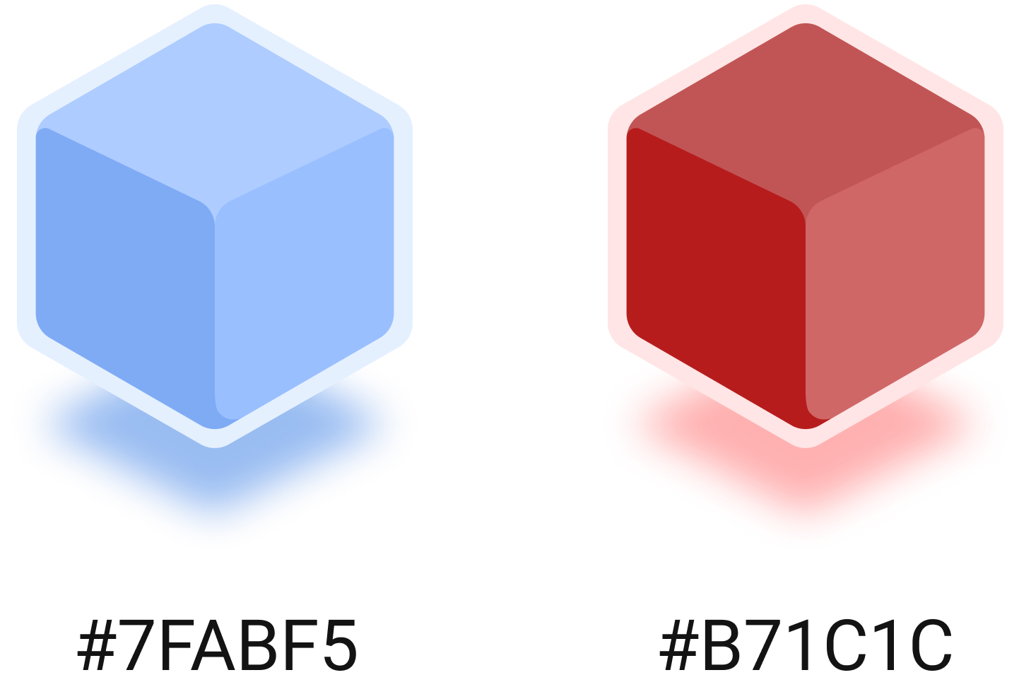
it's a start Brand Colors consist of a lighter blue #7FABF5, a lighter yellow #FFBB00, & white #FFFFFF. The Secondary Colors are the Google Colors but have been muted to still embody the Google Brand but with it's a start qualities to support an open-ended and inviting mood.

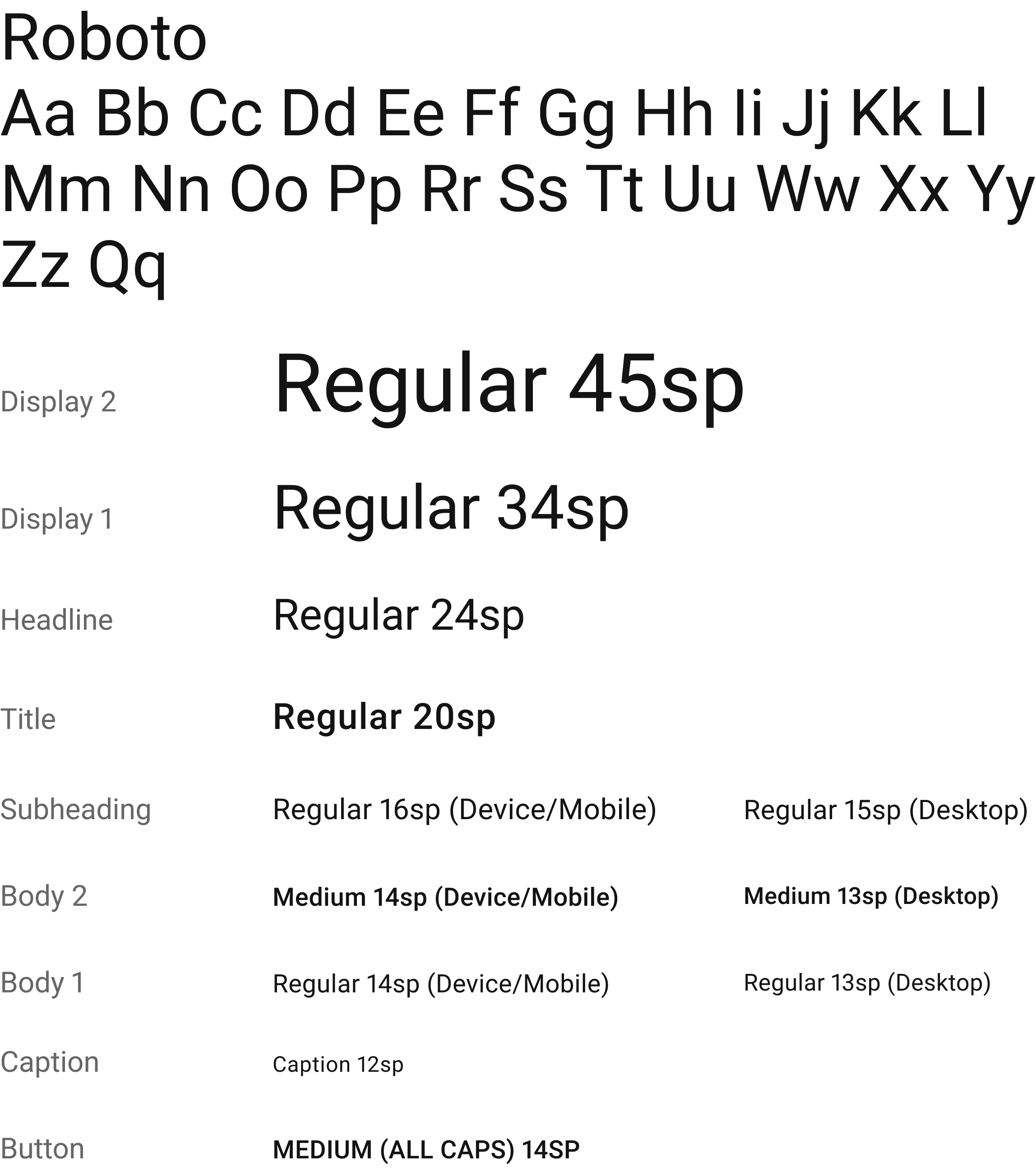
We used the Roboto font to keep a sense of connectedness with the Google brand. This font style also supports the open-ended & inviting mood that our product embodies. Having the font style as Roboto also makes the app more familiar to the average Google user.
We played around with different fonts and icons to show the It’s A Start brand. We really liked the connection between a play button and “starting” something, so we used it as our icon.

We further took inspiration from some Google app icons and kept it as a flat design but with a long shadow for depth.

The inspiration we collected after creating the lo-fi wireframes came from Dribble. We used the format from Twitch and embodied a muted Google Brand color to the UI design.
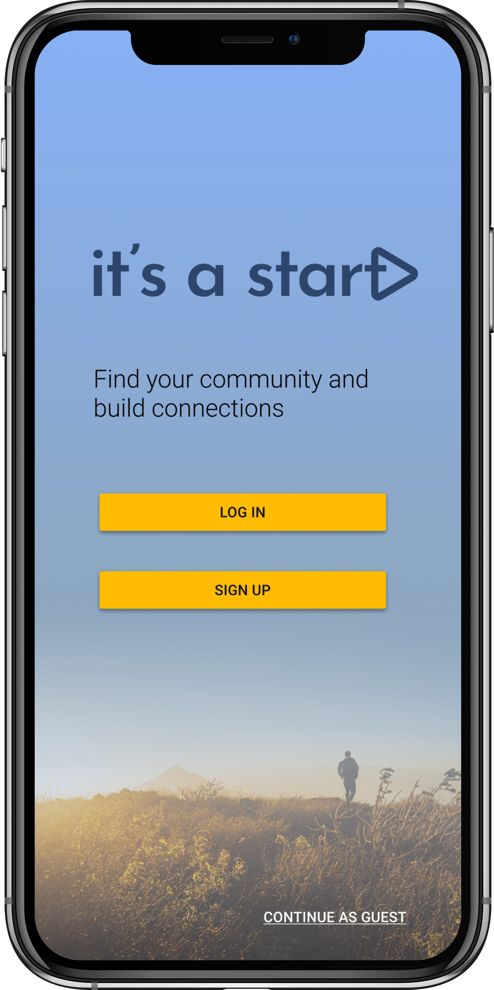
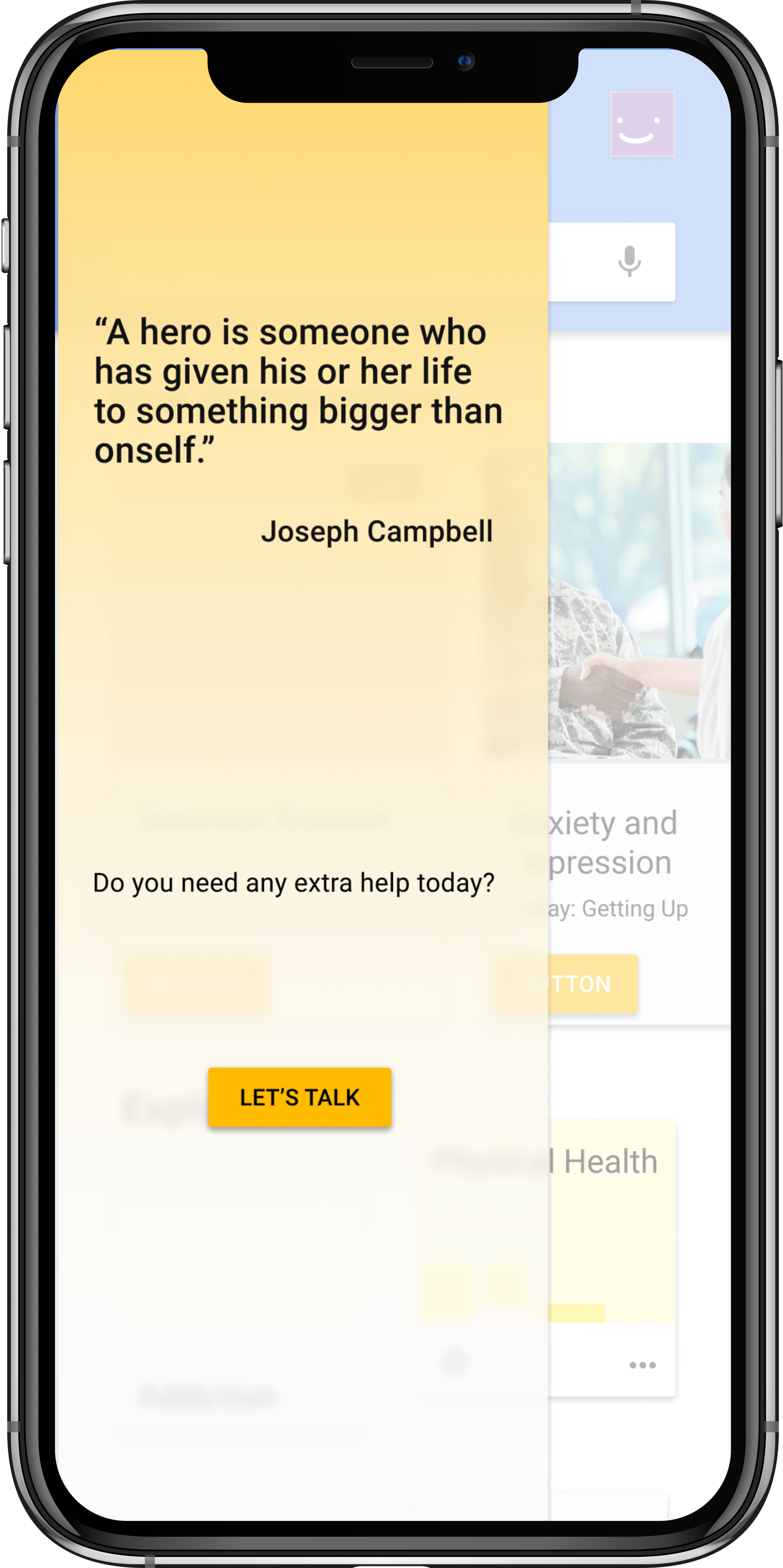
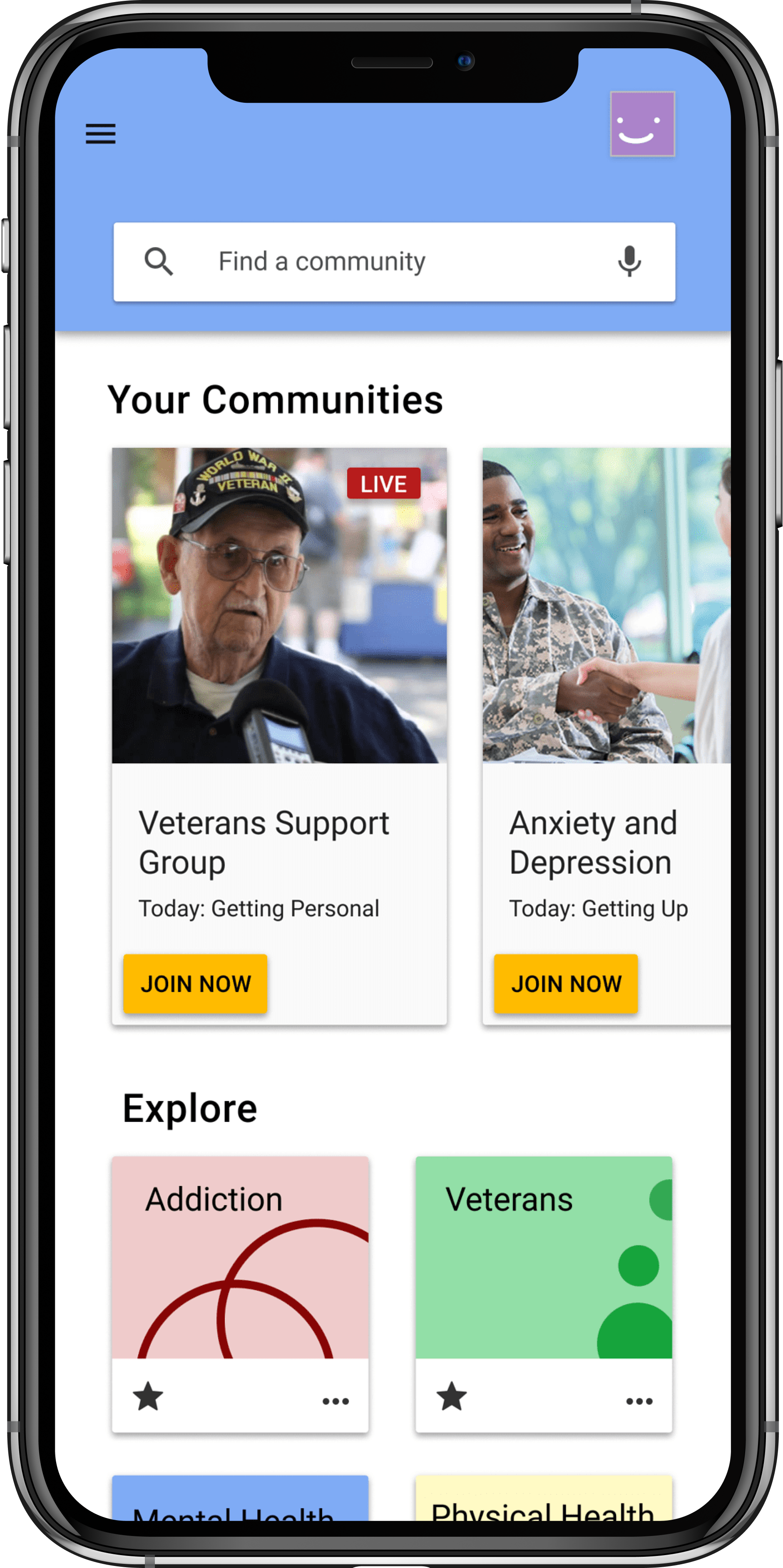
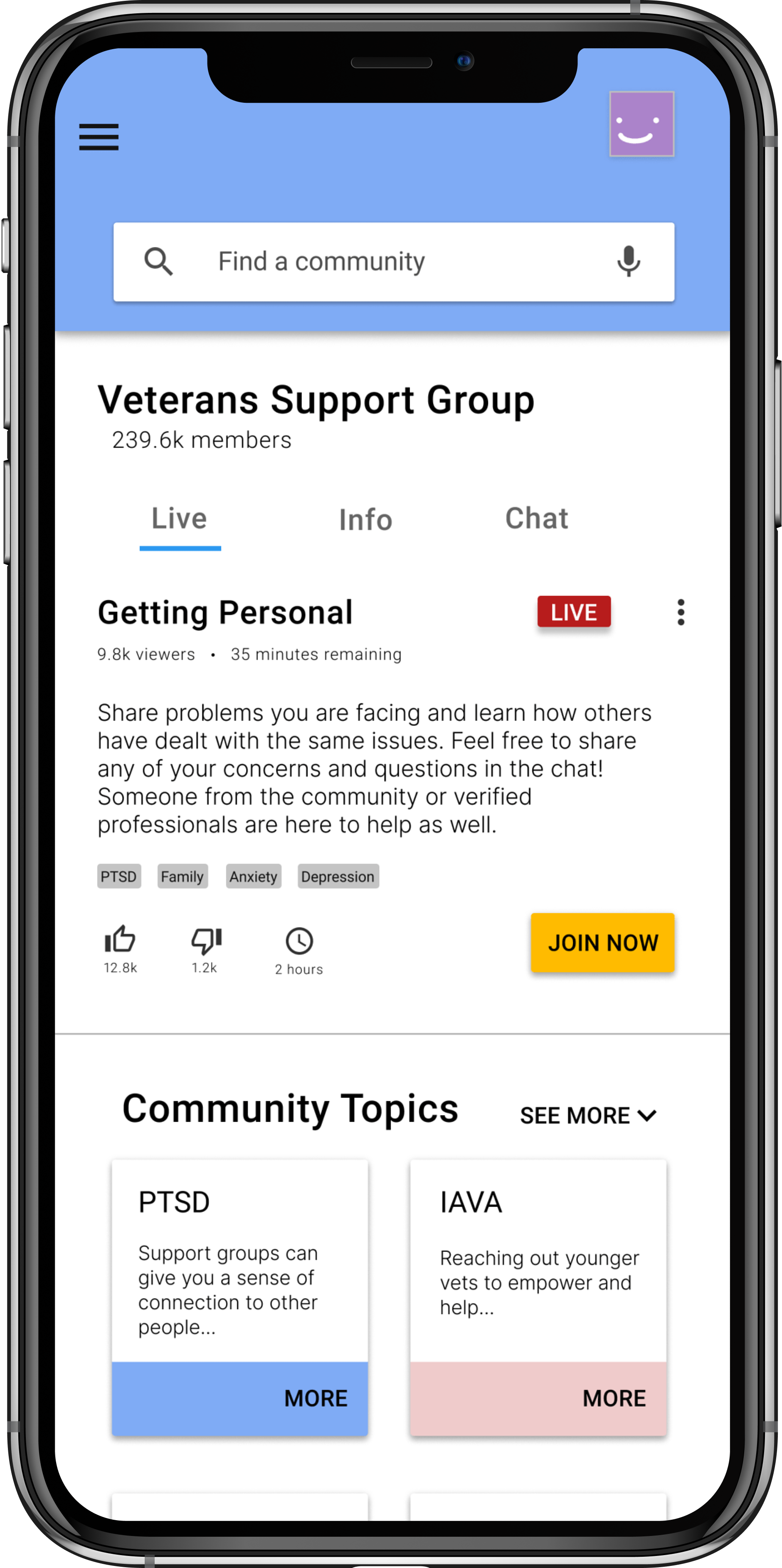
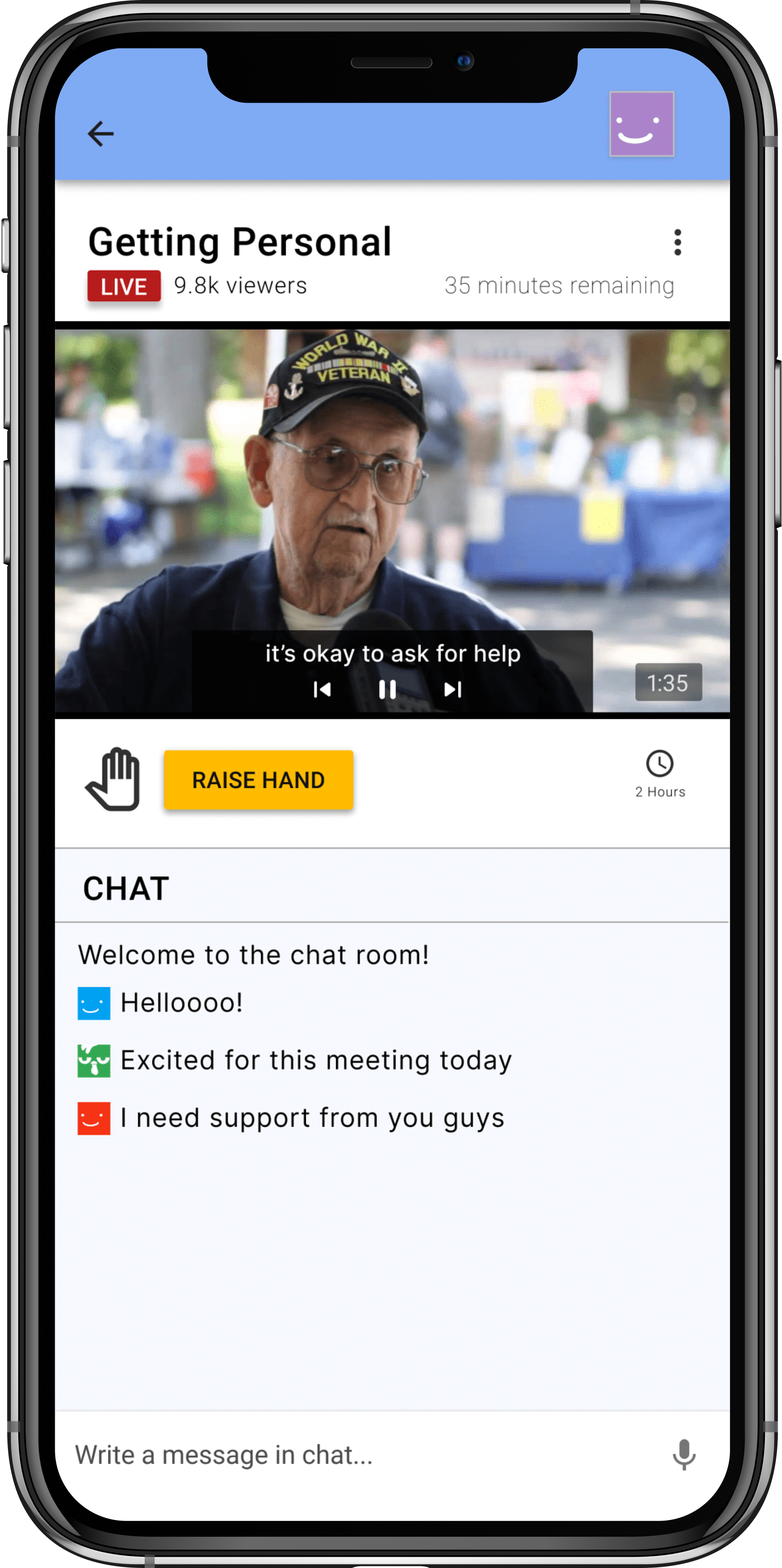
Moving forward we want to ensure we hit AAA and all accessibility guidelines, as well as expand the functionality of the live chat and features not shown in the design, and translate the mobile design to a desktop interface.
Want to learn more about my design process or see what else i've created?